Presentation Design
Branding
Presentation
Strategy
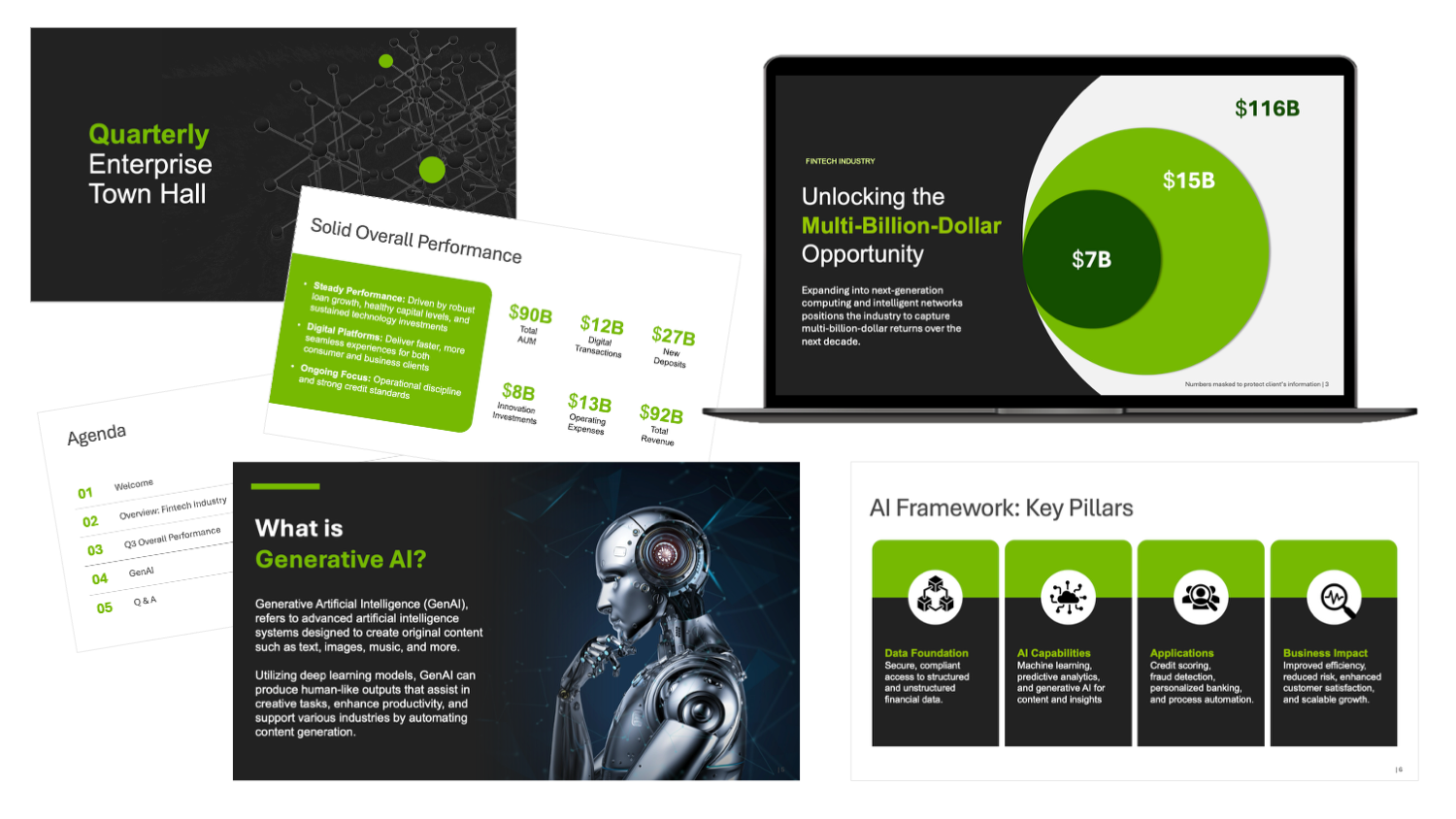
Enterprise Town Hall - Fintech Industry
Executive Presentation Design
An executive deck for a quarterly enterprise town hall in fintech. The brief was to take dense material (performance data and the company's AI framework) and make it legible to business units across the organization, whatever their distance from the technical detail. The deck is built on a clear narrative spine, with data visualization carrying the numbers that would otherwise crowd the slides.
Tone was the real problem to solve. It had to read as fintech-forward without giving up the credibility a finance audience expects. High-contrast color blocking and a tight palette do both, and color pairings were checked for accessibility so the slides hold for a neurodiverse audience.
Key elements: Executive Presentation Design | Visual Storytelling & Data Visualization | Digital Accessibility & Inclusive Design | Fintech Brand Alignment
Learn more
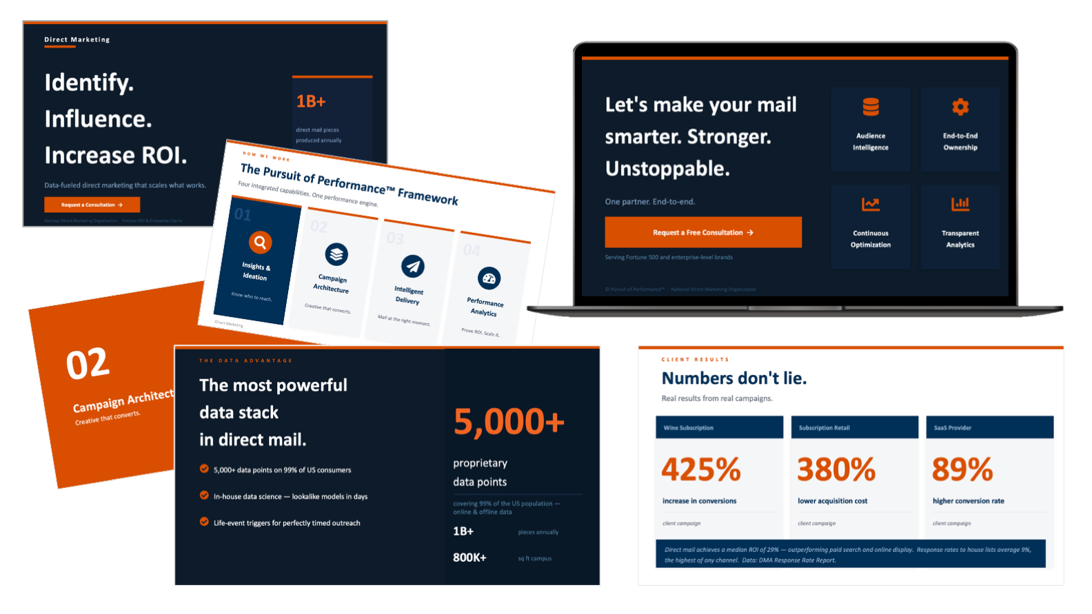
Direct Marketing Sales Deck
Engagement Deck
A client-facing sales deck built inside an existing brand system for a national direct marketing organization, designed as a companion to their broader presentation system. The sales team needed something they could walk a prospect through: not a document to read, but a tool to talk over.
So the deck moves the way a good pitch does, from audience intelligence at the top to measurable results at the close, with a clear hierarchy on every slide and data framed to make the argument rather than decorate it.
Key elements: Presentation Design | Sales Storytelling | Data Visualization | Brand Alignment
Learn more
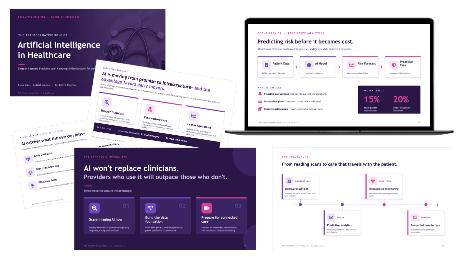
AI in Healthcare
Board of Directors Deck
A board-level briefing on AI in healthcare, a subject that's easy to make incomprehensible and hard to make actionable. The deck narrows to the two areas where the impact is clearest, medical imaging and predictive analytics, and explains both in language a non-technical board can follow and act on.
The organizing rule was one takeaway per slide. Each frame pairs a plain headline with custom data visualization, process flows, or a purpose-built benefits infographic, carrying the room from what the technology does to where it pays off and what to decide next. A purple-forward palette and bold sans-serif type keep it modern and assured without pulling focus from the argument.
Key elements: Presentation Design | Executive Storytelling | Data Visualization | Visual System Design
Learn more
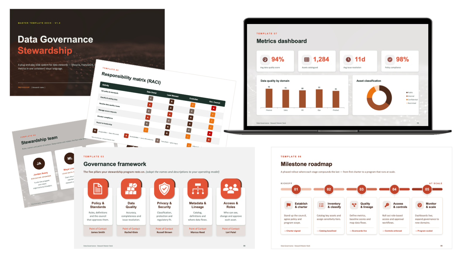
Data Governance Stewardship
Template Collection
A template system for communicating data governance work, which is some of the driest material an organization has to present and some of the hardest to get people to adopt. The collection pulls the usual moving parts (stewardship models, governance structures, performance metrics, and implementation roadmaps) into one visual language, so a deck for executives and a deck for the stakeholders doing the actual work still look and read like they belong together.
Each template turns the technical content into something an audience can follow, leaning on clear information hierarchy and purposeful data visualization rather than walls of text. Because governance rolls out across many teams and functions, the system is built to scale: consistent enough to stay on-brand, flexible enough that a function can adapt it without breaking the framework or rebuilding from scratch.
Key elements: Presentation Design | Design Systems | Data Visualization | Information Architecture | Executive Storytelling | Brand Alignment | Accessibility
Learn more
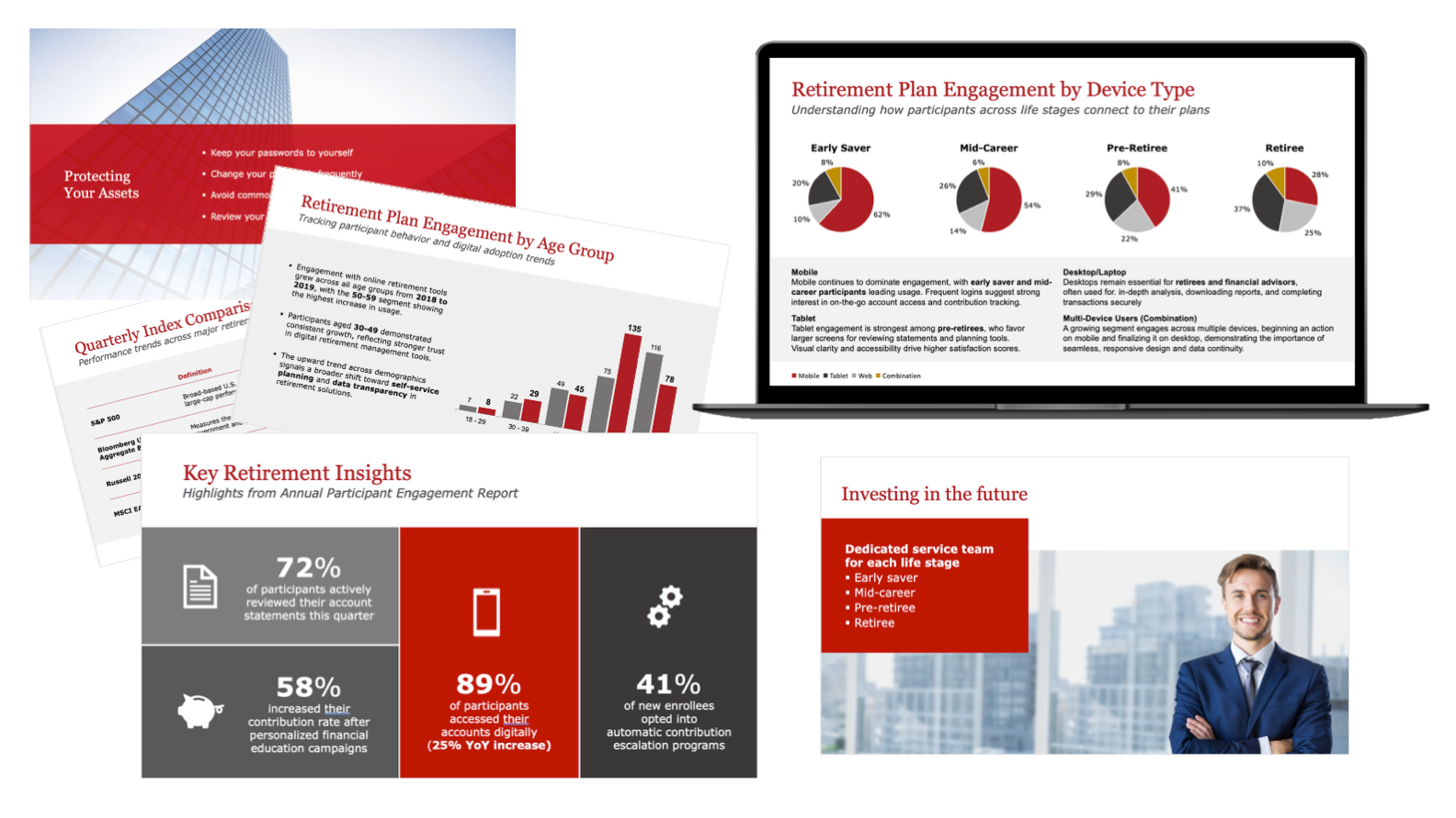
Financial Services Relationship Deck
Client Reporting Presentation Design
A reporting deck for relationship managers presenting to plan sponsors at quarterly business reviews. Retirement-plan analytics are dense by nature, so the work was turning that data into an insight-driven narrative a client could follow and trust, not just a stack of charts.
It's built to do double duty: a guide the relationship manager talks from in the room, and a leave-behind that holds up on its own afterward. A clean structure and consistent hierarchy keep the charts, reports, and performance metrics readable and on-brand from the first slide to the last.
Key elements: Presentation Design | Data Visualization | Brand Alignment | Communication Strategy | Layout & Color Coordination
Learn more