A Subject That Resists Being Understood
AI in healthcare punishes bad communication. It is technical enough to lose a non-specialist in a sentence, broad enough to sprawl across a dozen subtopics, and high-stakes enough that a board needs to leave the room knowing what to do, not just what is happening.
A briefing like this fails in two predictable ways. It either drowns the room in jargon and architecture only an engineer follows, or it waters the subject down into vague optimism that gives a board nothing to act on. Both leave the audience exactly where they started.
The design problem was to find the narrow path between those failures. Keep the substance a board needs to make a call, strip everything that does not serve that call, and make the whole thing readable at the pace a busy room actually moves.
- The argument legible in one read, not a document to study later
- Enough evidence to trust the claims, without drowning in detail
- A clear sense of where the value is and where it is already proven
- A defined set of moves to decide on by the final slide
- A tone that signals rigor, not hype
- Dense, jargon-heavy slides that only a specialist could follow
- A survey of every use case instead of a focused argument
- Walls of text where a visual should carry the point
- Stock charts that decorate rather than prove
- Vague optimism with no decision attached
The hard part was not the visuals. It was the discipline of deciding what to leave out so the rest could be understood.
Four Rules for the Boardroom
A board reads fast and decides faster. Four principles shaped every slide so the briefing earned attention and held it.
Every frame makes a single point, stated in a plain headline. A reader should grasp the slide before they finish the first line, then choose how much of the supporting detail to take in. Nothing competes for the main idea.
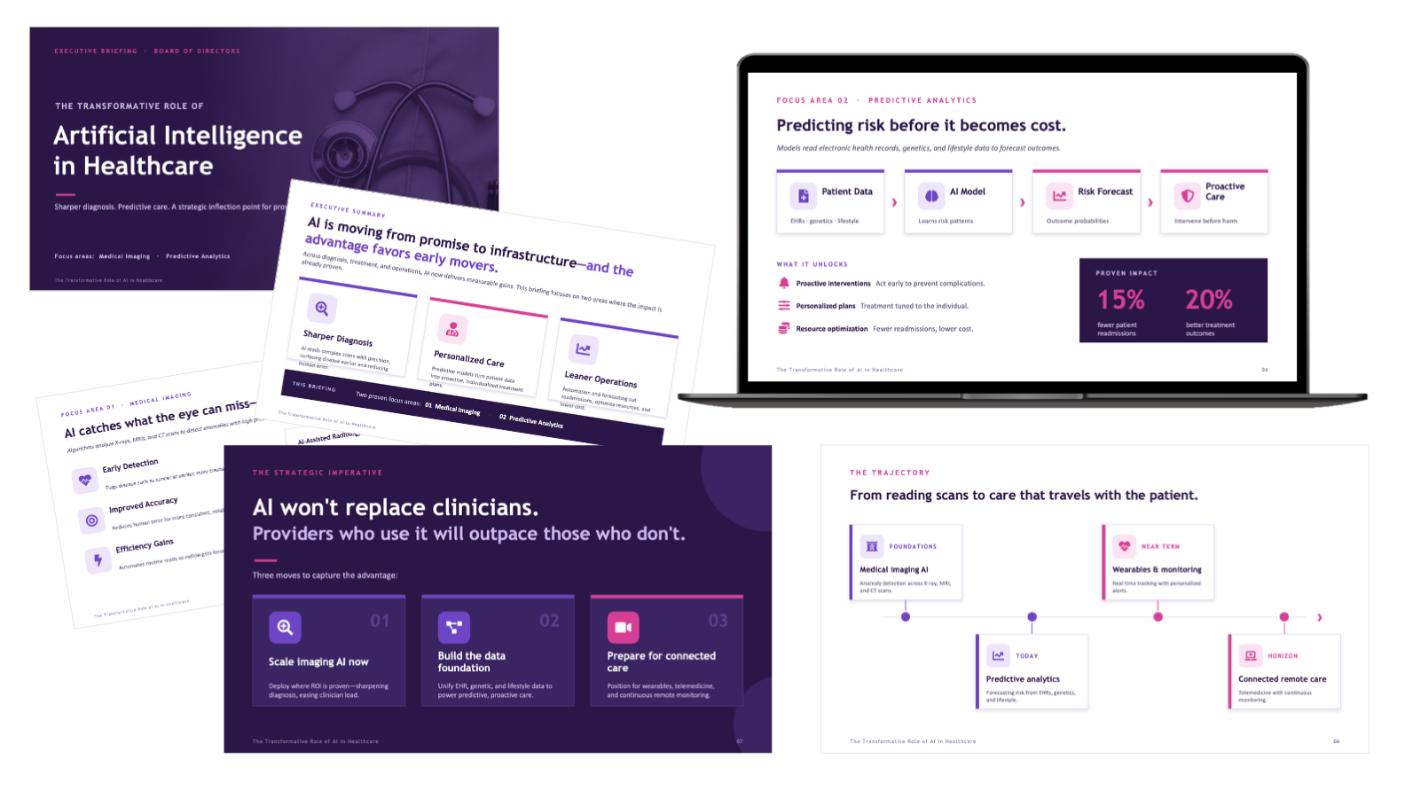
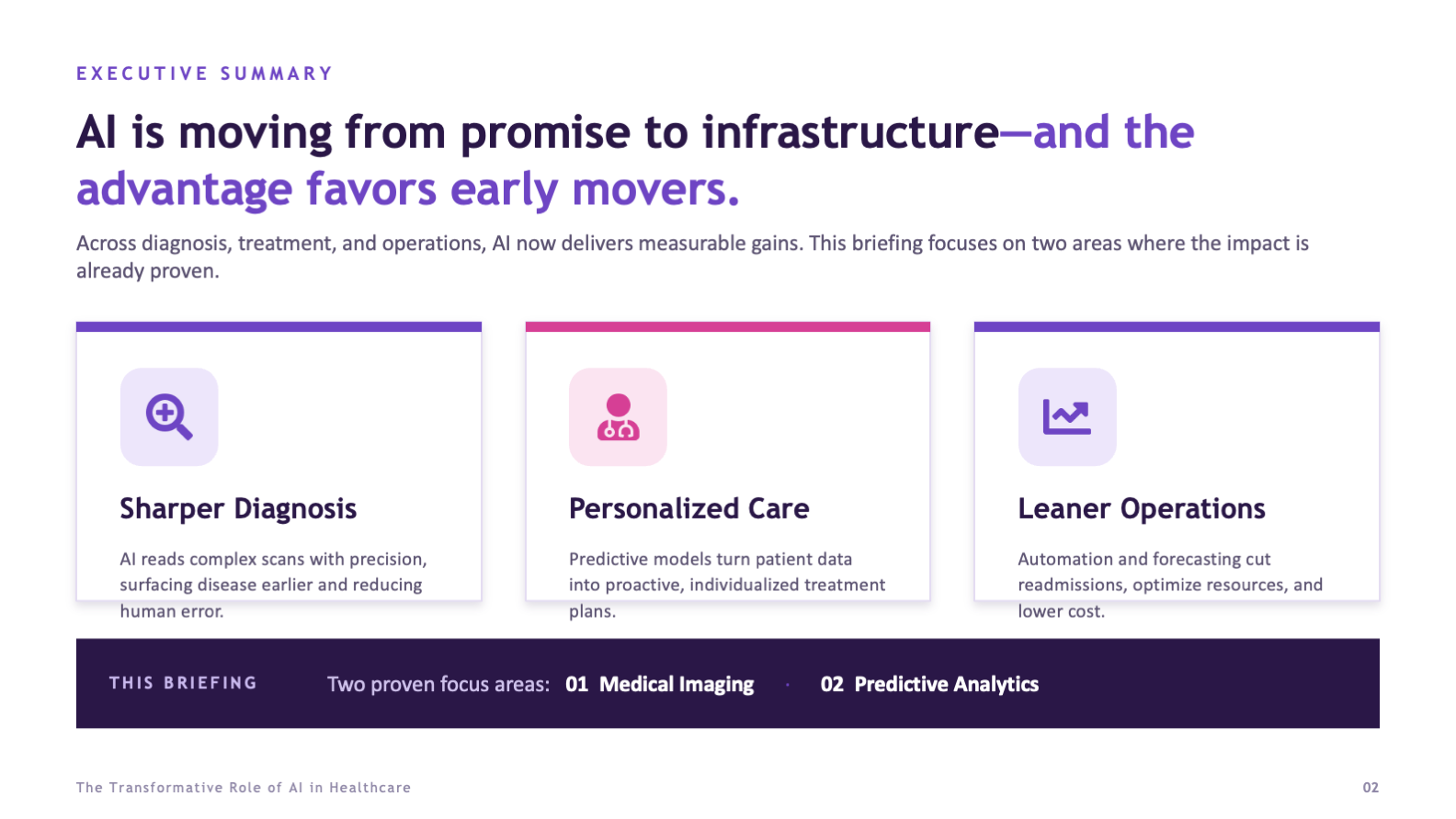
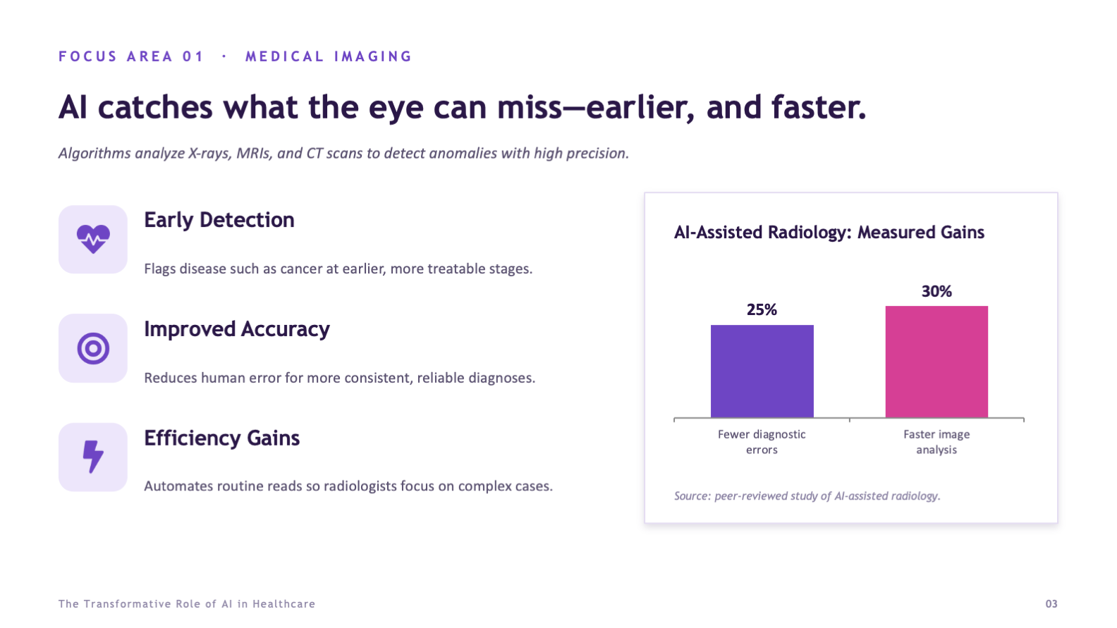
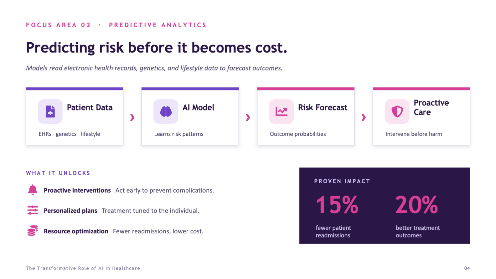
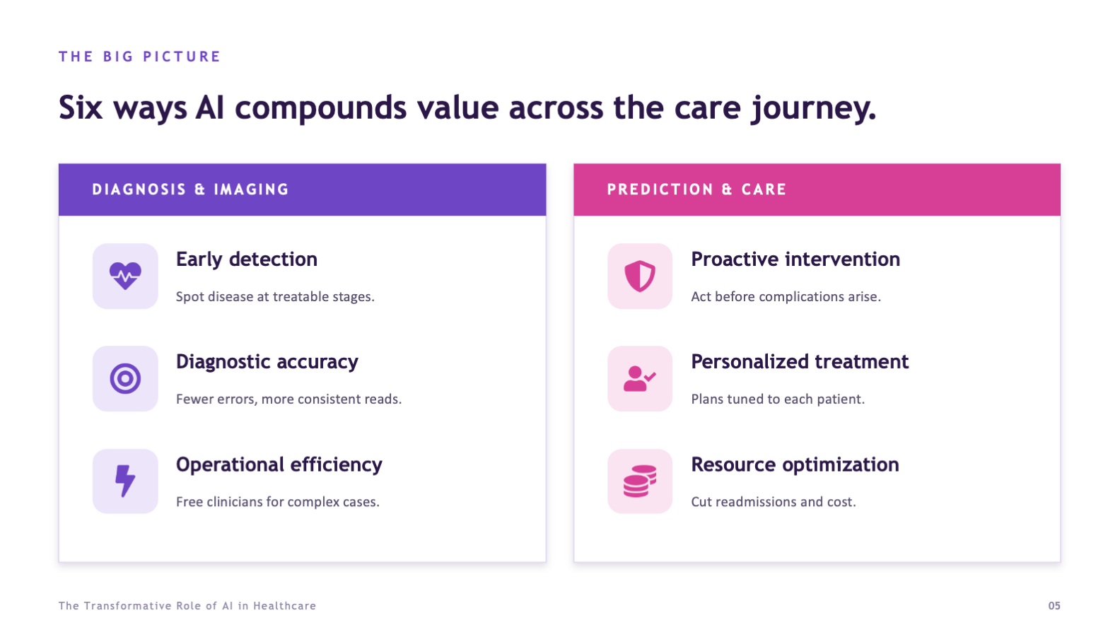
Rather than touch every possible application, the briefing commits to the two areas with the clearest proven impact, medical imaging and predictive analytics. Focus is what makes an argument persuasive instead of exhausting.
Where a figure matters, it is built into a purpose-made chart, process flow, or impact block, not buried in a sentence. The data does the convincing, and the eye gets there before the words do.
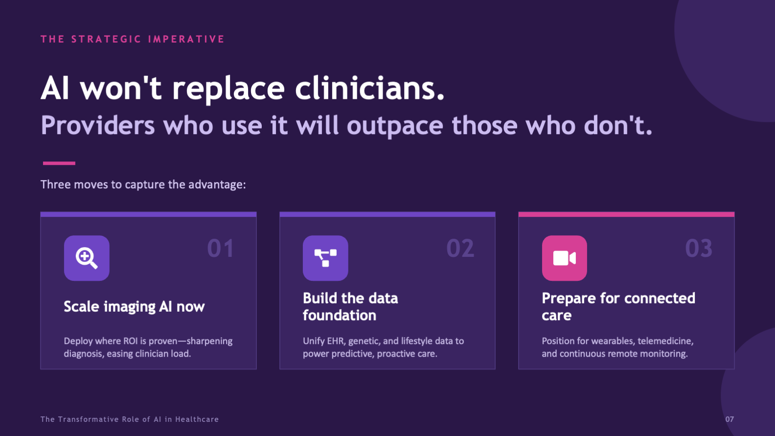
The deck builds toward a position and a concrete set of moves. By the final slide the room is not just informed, it has something specific to weigh in on. The whole arc bends toward that moment.
How the Briefing Is Built
The work was structure first, surface second. Before any slide was styled, the argument was edited down to a spine the room could follow without effort.
The narrative spine
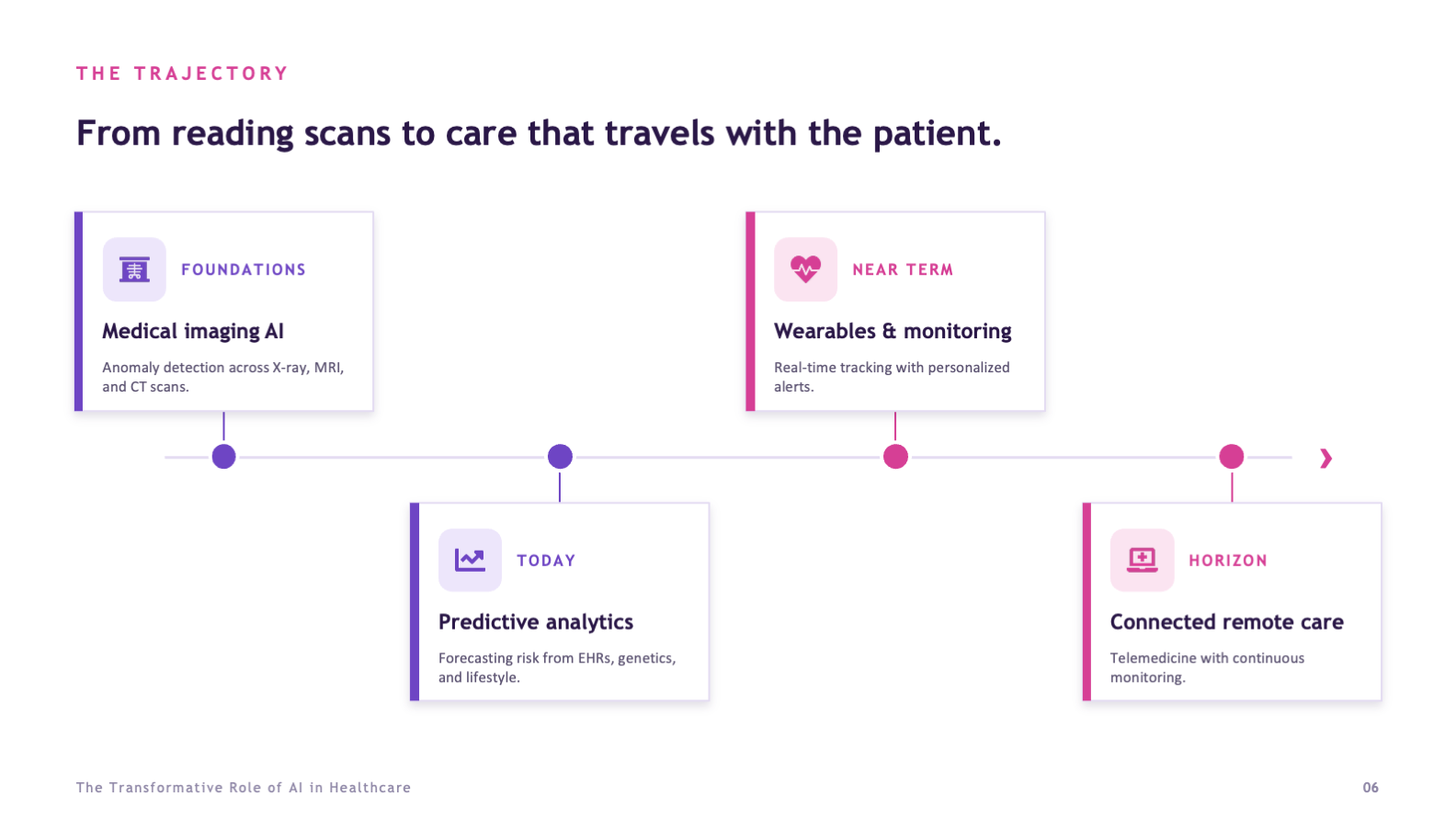
The briefing opens by framing AI as infrastructure rather than novelty, then immediately narrows the room's attention to the two focus areas the rest of the deck will prove out. From there it moves through each focus area, pulls them together into a single picture, maps the trajectory ahead, and closes on the decision. Context, then evidence, then call.
The visual system
A purple-forward palette with a pink accent keeps the deck modern and confident, while bold sans-serif headlines and generous spacing keep it credible and easy to scan. Custom iconography and a consistent slide architecture mean every frame feels part of the same briefing, so the audience spends its attention on the argument rather than relearning the layout each time.

Seven slides, one argument, no slide doing more than one job. That restraint is what makes a dense subject feel simple.
From Topic to Briefing
The deck came together in three passes, each one protecting the clarity of the last, so the final briefing reads as effortless even though the subject is not.
Edit the Argument
focus areas
takeaway / slide
Build the System
visual system
icon family
Design the Data
stock charts
slides
- A narrative arc from context to a concrete decision
- One plain-language takeaway anchoring every slide
- Custom data visualization for each key figure and concept
- A consistent visual system and custom icon set across all frames
- A tone calibrated for an executive, non-technical audience
A board does not read slides the way a study group does. They scan, they judge fast, and they decide. Every choice here, from the single-takeaway headlines to the high-contrast impact blocks, was made so the argument survives that pace and still lands with the weight it needs.
What the Design Achieves
The briefing takes a subject most decks make impenetrable and makes it readable in minutes. It gives a board the evidence to trust the claims, the focus to weigh them, and a clear set of moves to decide on, which is exactly what an executive audience needs and rarely gets.
Because the deck runs on a consistent system, it also holds up as a model. The same spine, the same data-visualization approach, and the same restraint could carry any dense, high-stakes topic to a room that has very little time and a real decision to make.
- A complex technical subject made readable in a single pass
- Evidence framed to build trust rather than overwhelm
- A focused argument a board can actually act on
- A close that converts attention into a decision
- A visual system credible enough for a finance-minded room
- Executive storytelling that bends a deck toward a decision
- Data visualization and information design built for an argument
- The editorial judgment to narrow a sprawling topic
- Tone control for a high-stakes, non-technical audience
- A repeatable visual system rather than a set of one-off slides