Branding
Branding
Presentation
Strategy
Elevate Financial
Brand Design & Strategy
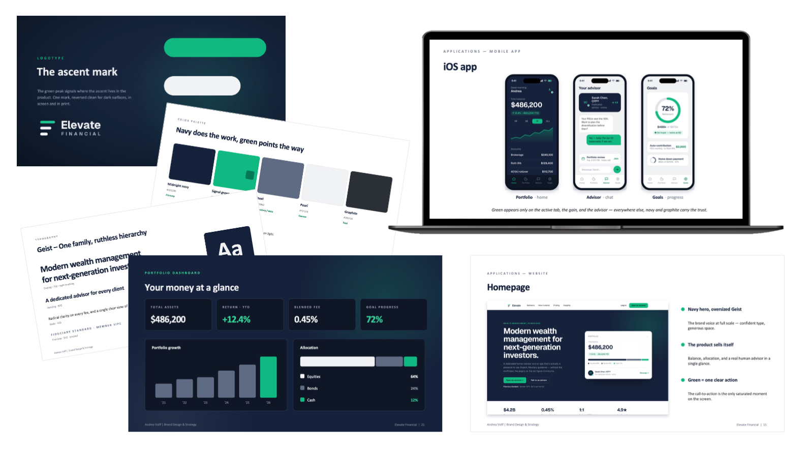
A ground-up brand identity and strategy for a regional wealth-management firm reinventing itself as a digital-first advisory platform for Millennial and Gen X investors.
The challenge was to feel genuinely modern and effortless without slipping into faceless robo-advisor territory or stuffy legacy-bank cliché. I built the brand from strategy outward (competitive positioning, audience personas, and brand attributes) then translated it into a complete visual and verbal system: the ascent logo, a disciplined navy palette with a single signal green reserved for the moments that matter, a Geist-based type system, and custom iconography. The identity was carried all the way through to a responsive website, an iOS app, and a client-ready presentation and template library.
Key elements: Brand Strategy & Positioning | Logo & Identity System | Color & Typography | Responsive Web & iOS App | Presentation Templates
Learn more
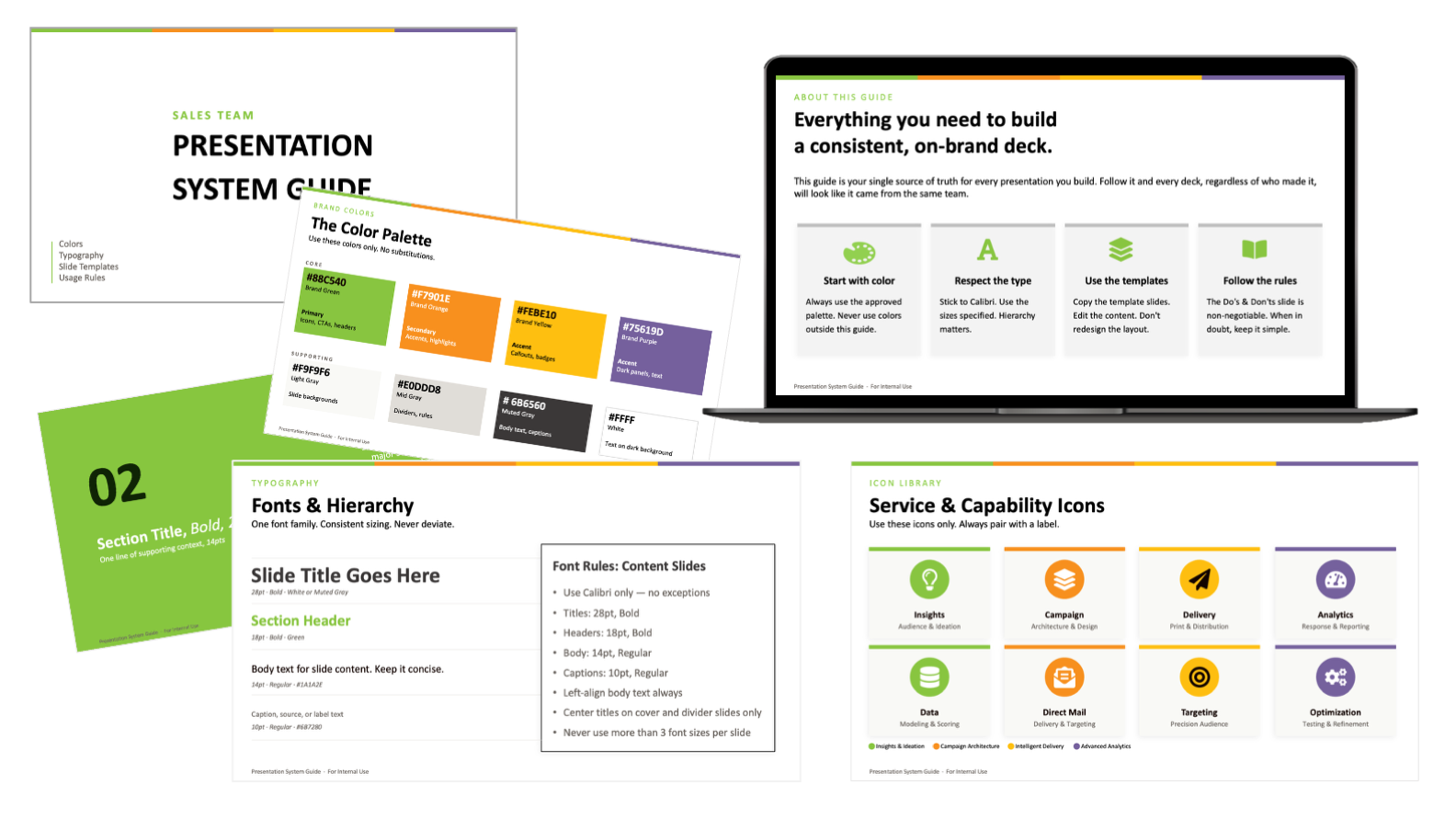
Direct Marketing Presentation Guide
Presentation System & Template Design
Contracted to design a scalable presentation system for a national direct marketing organization. Working within the company's existing brand, I developed a modular PowerPoint template library, custom iconography, and a brand usage guide to give the sales team a consistent, professional toolkit they could use independently. A companion walk-around sales deck was built to the same system for client-facing conversations.
Key elements: Presentation System Design | Slide Template Library | Custom Iconography | Sales Deck
Learn more
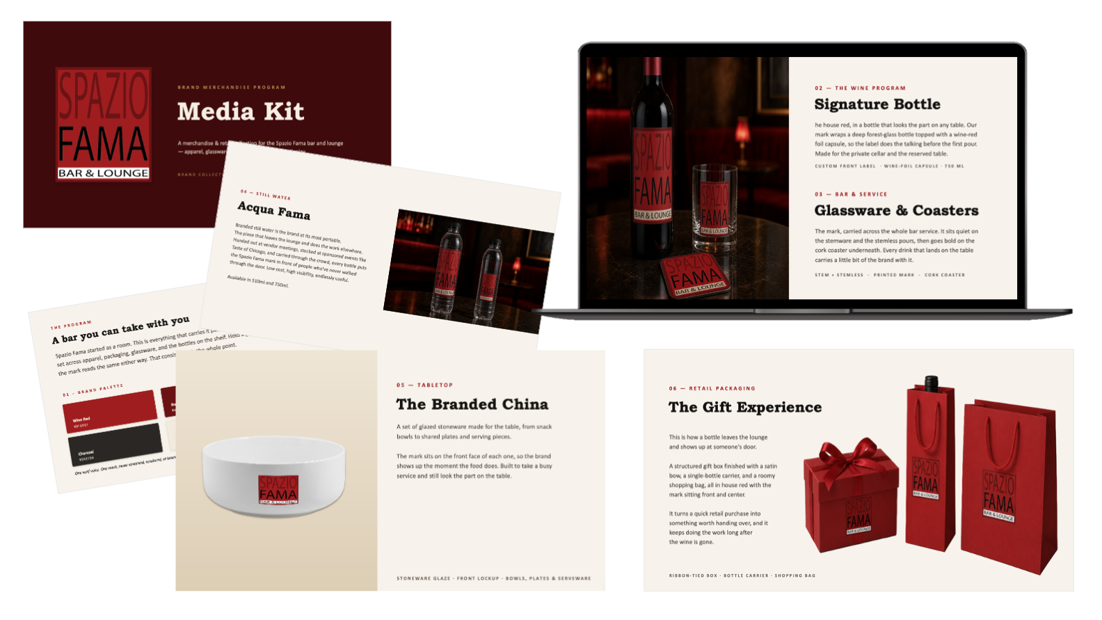
Spazio Fama Bar and Lounge
Brand Identity, Packaging & Merchandise Design
Spazio Fama is a rooftop lounge for young professionals, the kind of place you go to unwind and be seen. So the brand couldn't feel stiff or corporate. It had to look sharp but still feel like a good night out.
I started with the logo and built outward: one color palette, one serif voice, and a system that holds up wherever it lands. It runs across the menus, the takeout packaging, and a full merchandise line of apparel, glassware, ceramics, and house bottles, all sold from a retail corner inside the lounge. The logo never gets stretched or recolored, so it reads the same whether you're holding a glass at the bar or carrying a gift box out the door.
Best of all, it doesn't stop at the entrance. The brand follows you home, and gives the venue something to sell long after last call.
Key elements: Brand Identity System | Color & Typography Development | Menu & Packaging Design | Branded Merchandise Design
Learn more