A Brand That Stopped at the Front Door
Most bar brands live in exactly one place: the room. The logo sits on the door, the menu, maybe a coaster, and that is where it ends. Spazio Fama wanted more reach than that.
A lounge brand that only exists on site leaves both money and memory on the table. Guests connect with the place, then walk out holding nothing that carries it. There was no apparel to wear home, no bottle to gift, no packaging to hand across a counter, and nothing branded to bring to a sponsored event or a vendor meeting.
The opportunity was to turn the identity into inventory. For that to work, the mark had to move from a single printed logo into a system that could survive fabric, glass, ceramic, foil, paper, and plastic, and still read as one confident brand on every one of them.
- Merchandise guests would actually want to wear, use, and gift
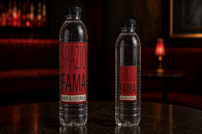
- A productized version of the bar's top sellers, wine and water
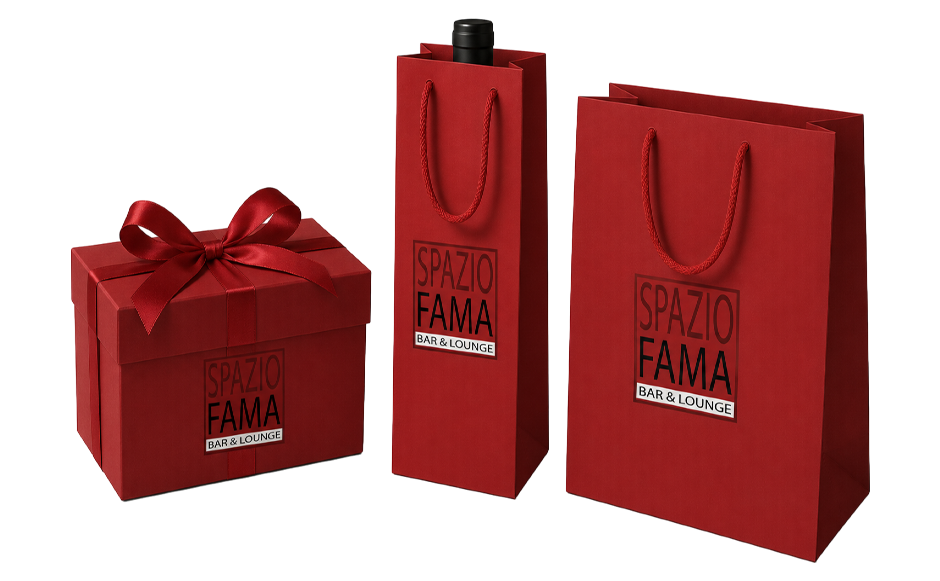
- Retail packaging that made a purchase feel like a gift
- Branded pieces that travel to events, festivals, and meetings
- One sell-ready kit to show partners and vendors what the brand offers
- Rules for applying one mark across very different materials
- A palette and type voice locked for repeatable, on-brand output
- Product mockups that showed each item the way it would ship
- A consistent retail and gifting language across formats and sizes
- A single document that packaged the whole offer for outside eyes
The challenge was never a shortage of ideas. It was the absence of a system that could hold one mark together across everything it touched.
Four Rules for One Mark
The goal was not a pile of separate products. It was a repeatable system that could grow item by item without ever losing the thread. Four principles governed every decision.
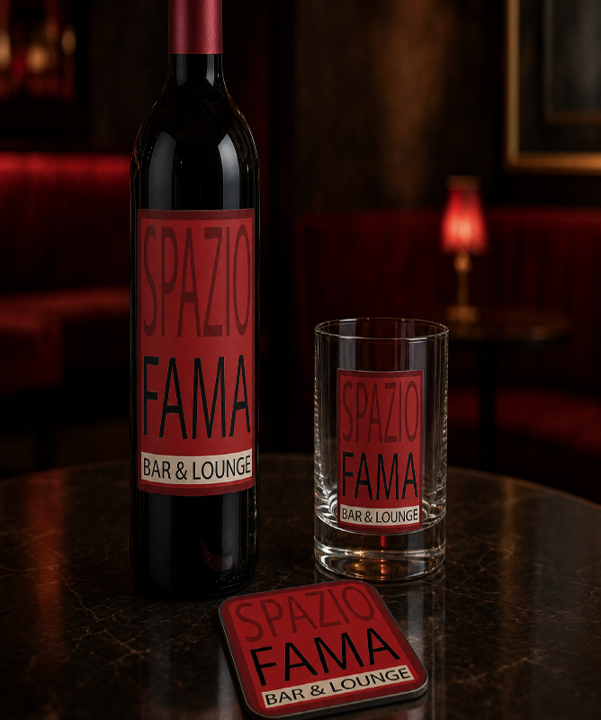
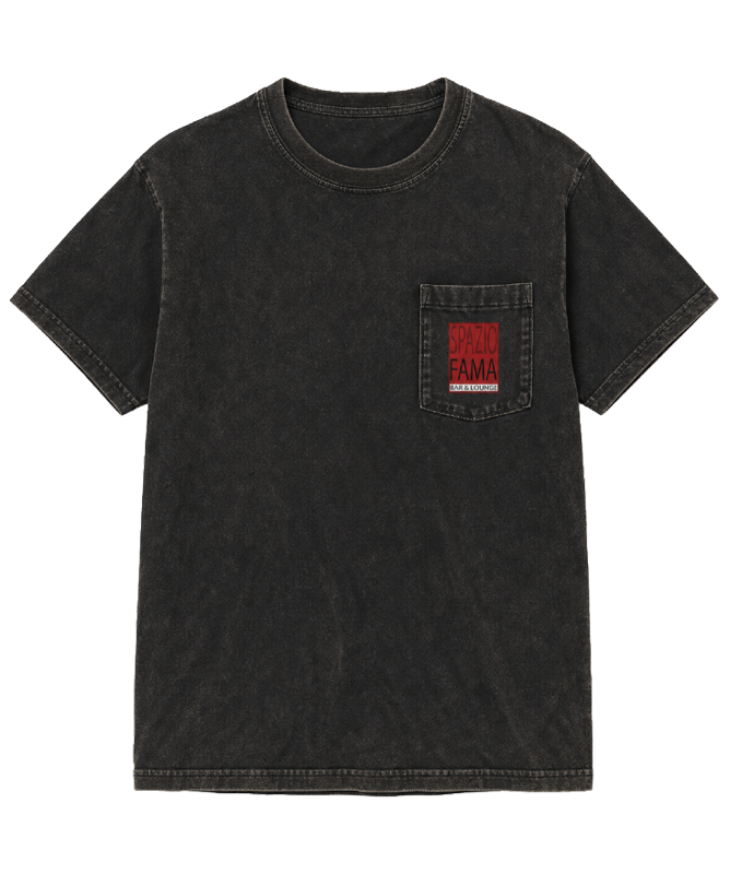
The logo is never recolored, stretched, or boxed in. On a wine label, a tote, or a gift box, it appears exactly as drawn. That restraint is what lets the brand read as one voice instead of a costume that changes by product.
The most valuable pieces are the ones that leave the lounge and keep working. A water bottle at a festival, a tee on the street, a gift box on someone's counter. Each one puts the mark in front of people who have never walked in.
Branded merchandise slides into gift-shop territory fast. Every item was designed to look at home on a set table or a retail shelf, so the collection reads as an extension of the lounge, not a rack of souvenirs.
This collection is an asset, not an afterthought. It gives the venue a retail line, a gifting program, and an event presence, so the brand earns its keep long after last call rather than just decorating the walls.
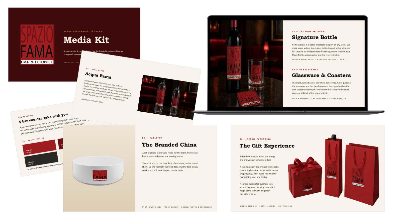
The Collection
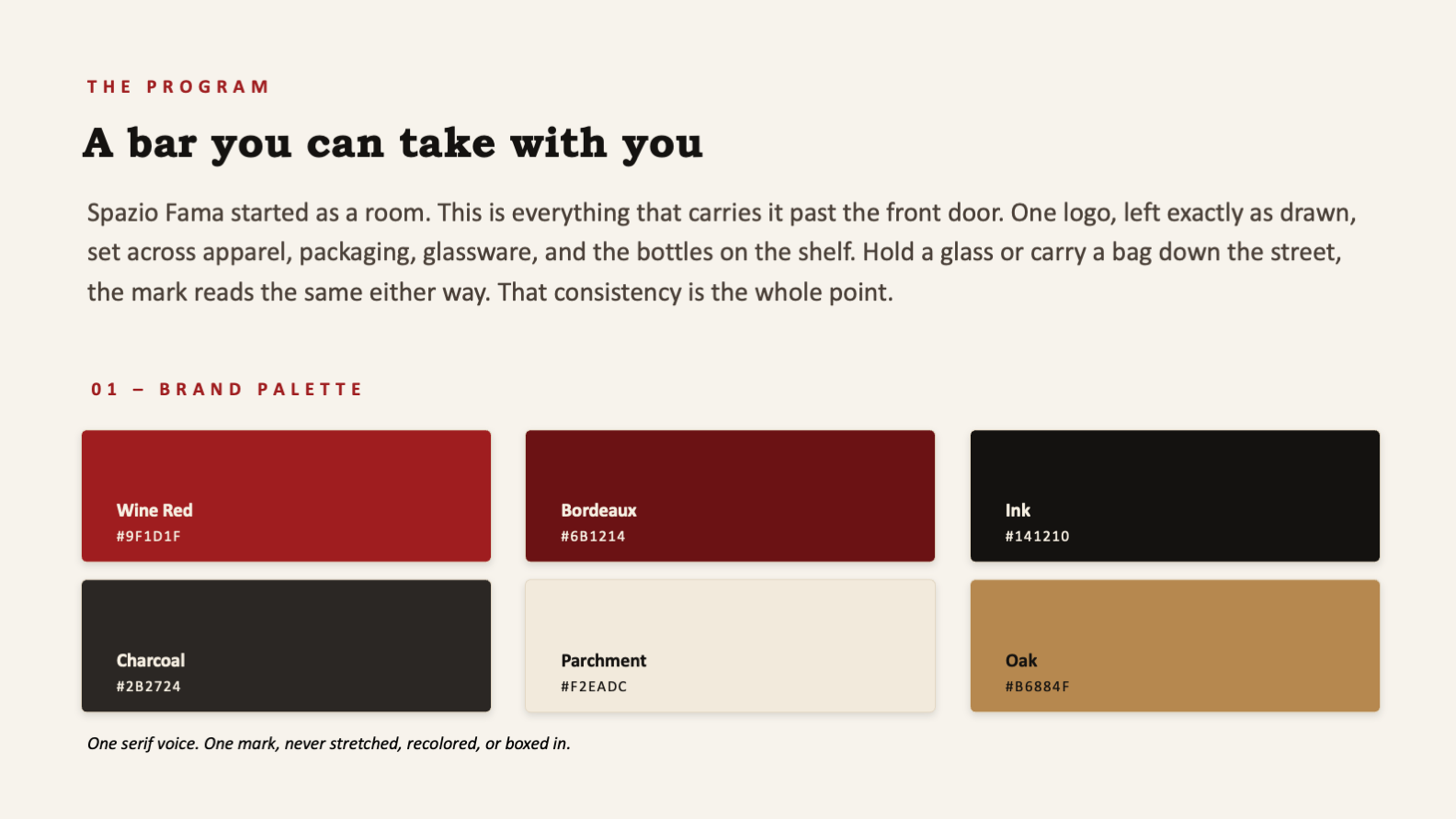
The work started with the system, then applied it. A single palette, one serif voice, and the unaltered lockup run through every piece, so a wine label, a water bottle, and a gift box all clearly belong to the same brand.
The brand system
Before a single product was rendered, the palette and type voice were locked so output stayed consistent no matter how the line grew. Wine red leads, bordeaux deepens it, ink and charcoal ground it, parchment opens it up, and oak warms it. One serif voice carries every headline and label.
The merchandise
Each item was designed as a realistic product mockup, shown the way it would actually ship, so the collection could be evaluated and sold before anything went to production.
Six lines, one mark, zero compromises on consistency. Pick up any single piece and the whole brand is legible in it.
From One Logo to a Full Line
The build moved through three phases, each one protecting the consistency of the last, so the collection arrived both on brand and ready to present.
Lock the System
palette colors
serif voice
Apply to Product
product lines
bottle sizes
Package the Offer
media kit
cohesive brand
- A locked color palette and type system governing the whole line
- Logo application rules that keep the mark unaltered on every surface
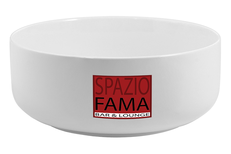
- Realistic product mockups for apparel, wine, glassware, ceramics, water, and packaging
- A retail and gifting language consistent across formats and sizes
- A sell-ready media kit packaging the entire offer for outside audiences
The real craft sat in the differences between materials. A red mark on a clear water bottle, a foil capsule, a glazed bowl, and a fabric pocket each behave differently under light. Each application was tuned so the logo stayed true to itself while still looking native to the object it lived on.
What the Collection Unlocks
The collection gives Spazio Fama three things a logo on a door never could: a retail line, a gifting program, and a presence that travels. The brand stops being a place you visit and becomes a thing you can own, carry, and pass along.
Because the whole line runs on one locked system, it can keep growing without a designer in the room for every new item. A new product simply inherits the same palette, the same voice, and the same unaltered mark, and it belongs immediately.
- A retail revenue line drawn straight from the brand
- Event and sponsorship presence through portable, branded pieces
- A gifting program that turns a purchase into something worth handing over
- Brand recall that follows guests out the door and into their week
- A repeatable framework that absorbs new products without losing consistency
- Brand systems thinking applied to physical products, not just screens
- The restraint to hold one mark across an entire range of materials
- Packaging and merchandise design with a real retail sensibility
- Product mockups convincing enough to sell from before production
- The ability to package a full offer into one persuasive, handoff-ready document