Branding
Branding
Presentation
Strategy
Elevate Financial
Elevate Financial is a regional wealth-management firm reinventing itself as a digital-first advisory platform for Millennial and Gen X investors. Perceived as traditional, conservative, and outdated, it needed to feel genuinely modern without losing the trust it had spent decades earning.
This self-initiated concept project builds the brand from strategy outward: competitive positioning, audience personas, and a complete visual and verbal system, then carries that system all the way through to a responsive website, an iOS app, and a client-ready presentation kit.
One idea anchors everything: the discipline of old-money wealth management, with the clarity of modern software.
The Challenge
Modernize a trusted-but-dated wealth brand for a younger generation of investors without tipping into either of the two traps the category usually falls into.
Millennial and Gen X investors have outgrown DIY trading apps but distrust both faceless robo-advisors and their parents' stuffy brokerage. The brand had to read as modern and effortless while still signaling the seriousness of managing real money.
- Feel genuinely modern, clear, and effortless
- Speak to next-generation investors on their terms
- Signal real, human, fiduciary advice
- Preserve decades of hard-earned trust
- Scale across web, mobile, and sales materials
- The faceless robo-advisor: sleek, but with no human to call
- The stuffy legacy bank: trusted, but dated and intimidating
- Generic fintech color: the usual red-and-blue
- Hype and adrenaline over composure
- Trust sacrificed in the chase for "modern"
The real risk wasn't looking old. It was losing trust while chasing modern.
Positioning & Strategy
A competitive audit revealed the opening: the accessible end of the market is abandoning human advice, while the firms that keep it price it out or wrap it in legacy tools.
That gap became the strategy. Elevate's heritage isn't a liability to hide, it is the moat the pure-play fintechs can't copy and are actively walking away from. The positioning pairs real human advisors with an experience as clear and well-designed as the best consumer software.
“Modern wealth management for next-generation investors.” Expert, fiduciary advice that finally feels personal, transparent, and effortless for the mass-affluent; not just the high-net-worth tier.
The discipline of old-money wealth management, expressed through the clarity of modern software. Trust and modernity stop being opposites and become the same gesture.
Brand attributes
Composed: Generous whitespace and restraint, the opposite of a trading app's red-and-green adrenaline.
Exacting: A rigorous grid and immaculate data, as a form of respect for the client's money.
Lucid: Plain language and number-forward layouts. Nothing hidden, especially on fees.
Candid: A fiduciary tells the truth. No dark patterns, no jargon, no spin.
Who It's For
Three people, one tension: they want human expertise without the condescension, and digital clarity without the abandonment.
The Equity-Comp Builder
Suddenly has real money and no idea if he's doing it right. Tried a robo, but handing six figures to an algorithm with no one to call feels reckless.
The Sandwiched Planner
Wants a real person, just not her father's stuffy advisor. Needs clarity on fees and one place to see the whole messy picture.
The DIY Graduate
His portfolio got complex enough that going it alone is now a liability. Wants to hand off complexity to an expert who won't talk down to him.
The Identity System
With the strategy set, the attributes did most of the design work. The system became a series of disciplined decisions rather than a blank page.
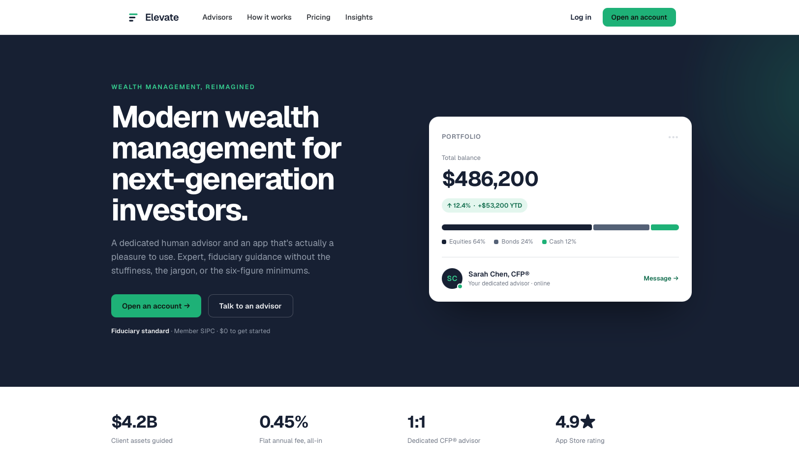
The green peak previews where the accent lives in the product. A one-color navy / pearl mark exists for single-color, small-size, and print use. The mark reads as both rising stages of a financial plan and the letter's ascent, with the green bar previewing exactly where the accent lives in the product. It stays monochrome where flexibility matters and carries the green where impact does.


Color
Navy does the work and green points the way.
The accent appears only on the action, the gain, and the advisor.
- Midnight Navy #16223B Primary — trust & backgrounds
- Signal Green #10B981 Accent — action, gains, advisor
- Steel #5E6B82 Secondary — data & support
- Pearl #F1F2F4 Canvas — light backgrounds
- Graphite #2B2F36 Text — primary body copy
I deliberately avoided the category's default red-and-blue. A near-monochrome navy system signals old-money discipline, while a single saturated signal green split into a bright core and an accessible deep variant does all the directing. Restraint is the luxury cue.
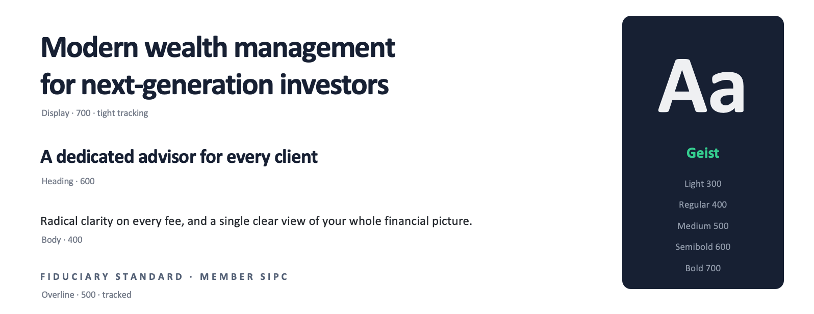
Typography
Dropping the serif made the system more honest to its Apple/Nvidia-modern register: one family from hero to fine print, with weight and space carrying the entire hierarchy. The discipline now lives in the rigor rather than in a typeface.
The System in Product
A brand only proves itself in use. The navy field, oversized Geist, and single green call-to-action were built for real layouts.
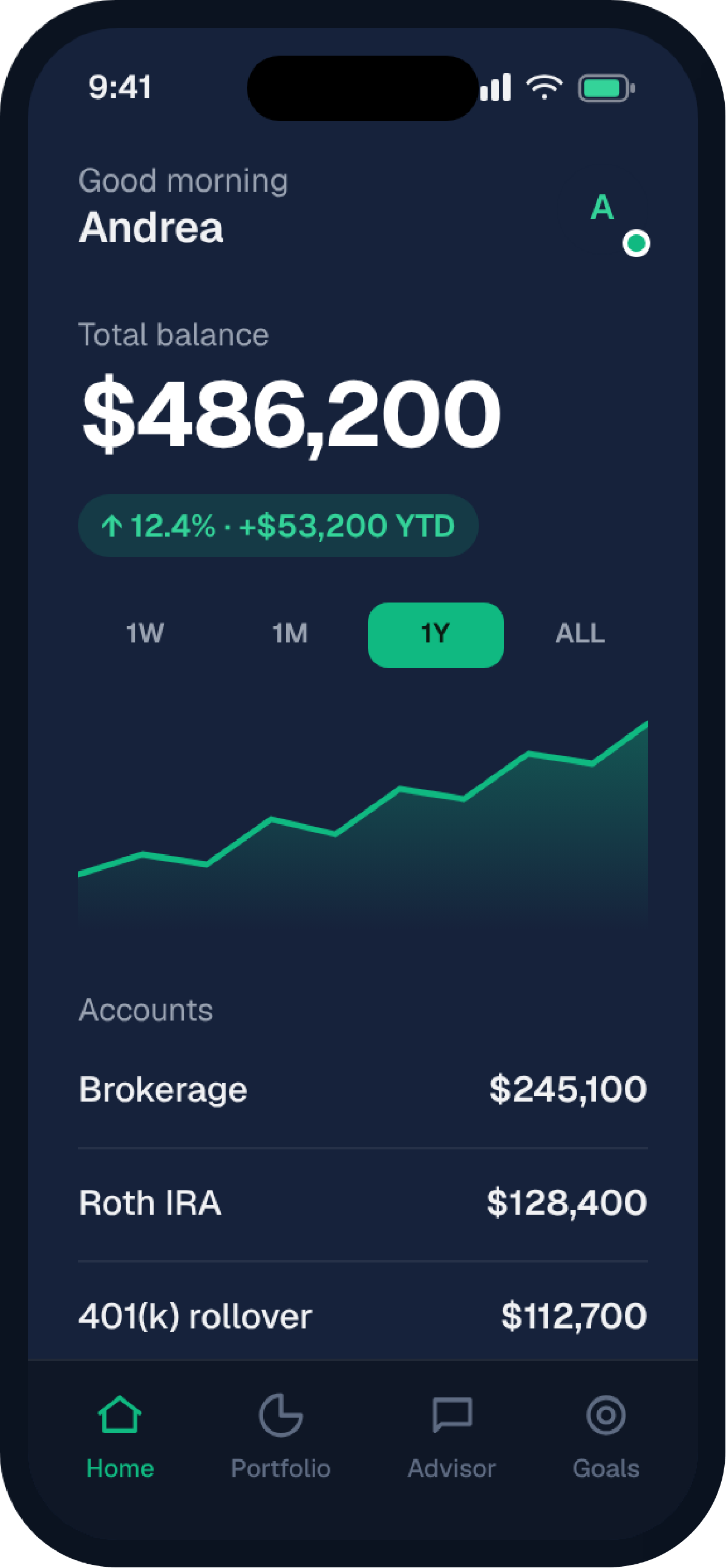
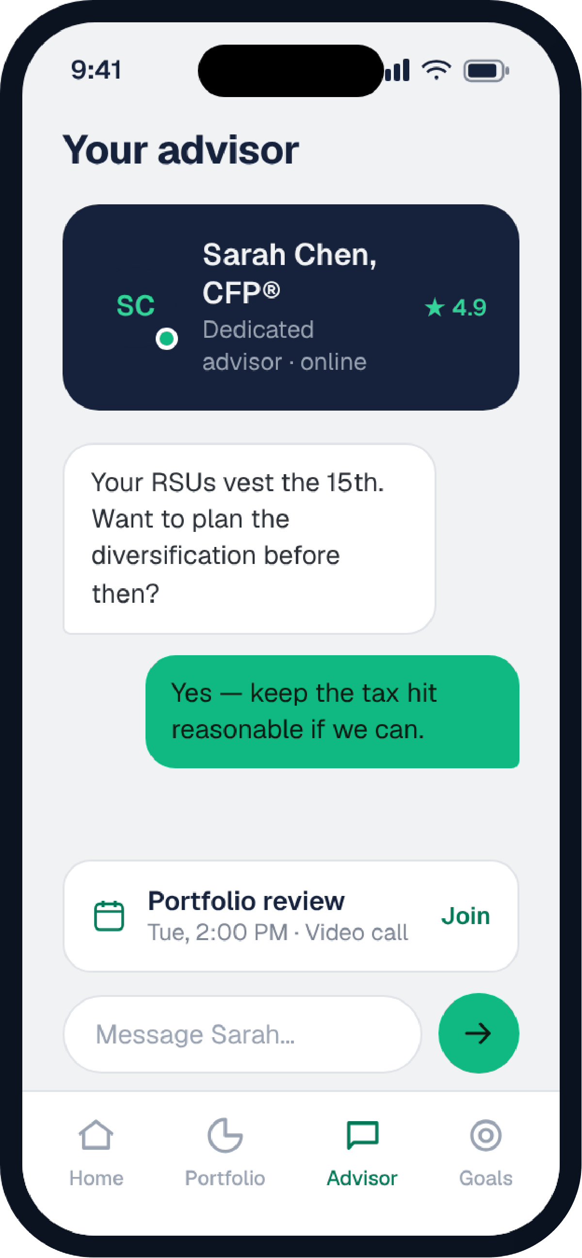
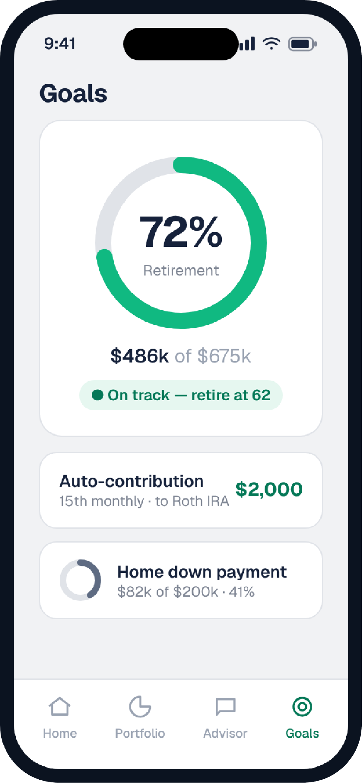
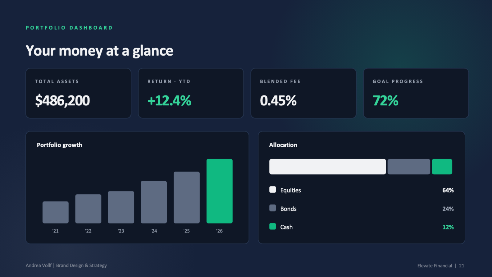
iOS app
Three core screens carry the product story. Green appears only on the active tab, the gain, and the advisor. Everywhere else, navy and graphite carry the trust.
What It Demonstrates
Strategy through identity through product. A complete, internally consistent brand where every decision traces back to a single positioning idea.
- A flexible logo system: positive, reversed, and responsive
- A disciplined, accessible color and type system
- Custom iconography and a consistent visual voice
- Responsive website and native iOS app design
- A client-ready presentation and template kit
- Brand strategy translated into a working visual system
- Positioning that turns a weakness into a moat
- Design discipline, restraint as the luxury cue
- End-to-end execution across brand, web, and product
- Systems thinking, from first principle to fine print