
The Hardest Audience Is All of It
A town hall is the one deck the entire company sees at once. Engineers and account managers, analysts and operators, people who live in the numbers and people who never touch them, all in the same room reading the same slide. The material does not get simpler to suit them, because performance data and an AI framework are dense by nature.
A deck like this fails in two familiar ways. It pitches to the specialists and loses everyone else in jargon and detail, or it flattens the content into vague good news that gives no one anything real to take away. Either way, most of the room leaves having watched rather than understood.
The work was to find the line between those failures. Keep the substance each unit actually reported, cut what does not earn its place, and make every slide readable at the pace a full-company meeting moves, for every kind of reader in it.
- The argument legible in one pass, for technical and non-technical viewers alike
- Each unit's numbers framed so the result lands before the detail
- A clear sense of how the parts add up to one company story
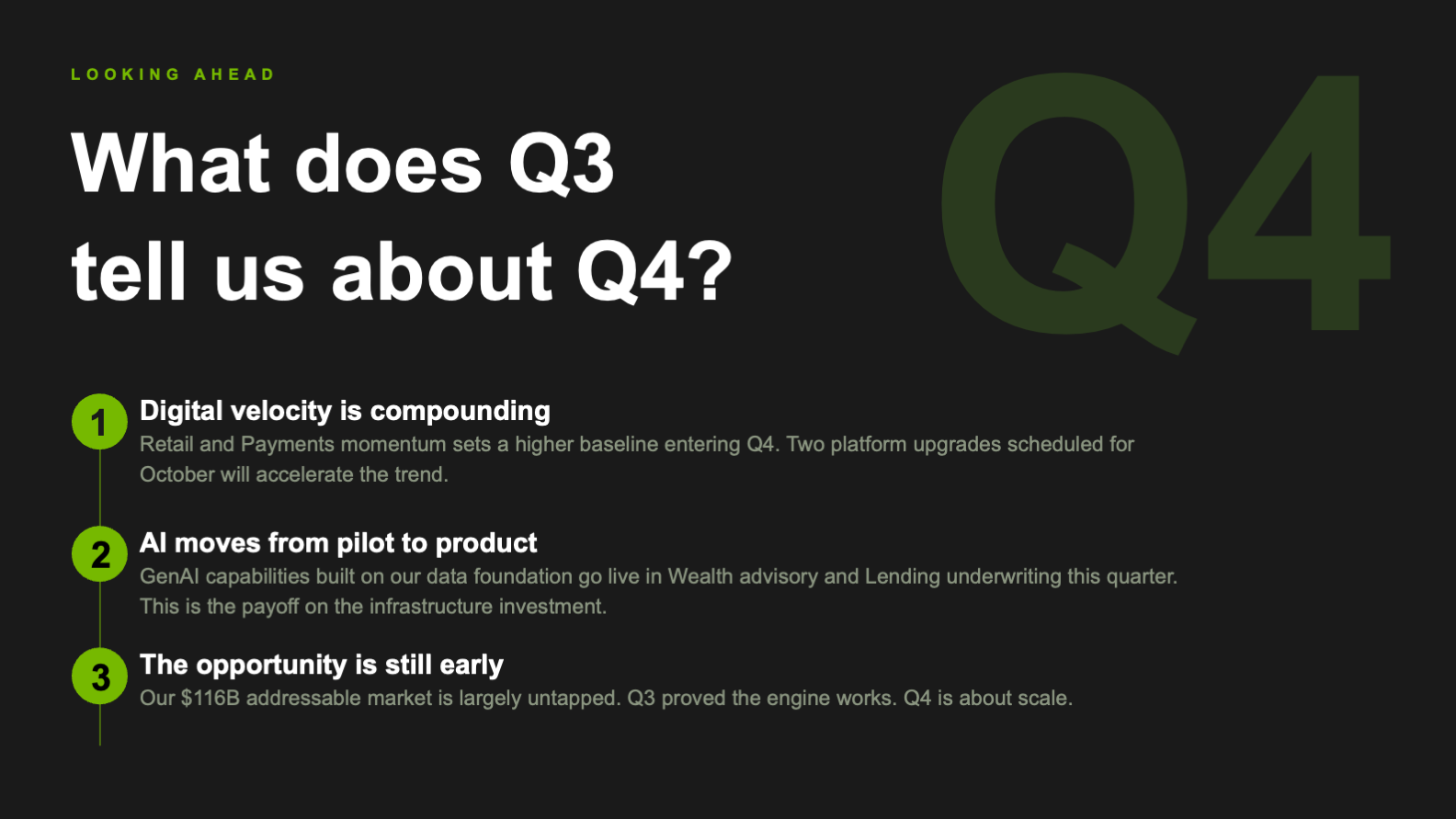
- A read on what the quarter means going forward, not just what happened
- Color and contrast that hold for a neurodiverse room
- Slides pitched to specialists that lose the rest of the room
- Four unit updates that never resolve into one narrative
- Walls of figures where a chart should carry the point
- A palette that looks current but fails on contrast
- A recap that ends with no sense of direction
The challenge was never decoration. It was making one dense quarter readable to a room that does not share a single level of fluency.
Four Rules for a Full Room
A town hall audience is broad, busy, and only half-fluent in any given slide. Four principles shaped the deck so it earned a mixed room's attention and held it.
Every slide is designed so the person furthest from the detail still gets the point. Plain headlines, one idea per frame, and a visual that does the explaining mean no one is left behind, while no one fluent is left bored.
Where a figure matters it is built into a purpose-made chart, stat block, or framework, not buried in a sentence. The eye reaches the result before the words do, which is the only way numbers land in a fast room.
The color blocking that makes the deck feel fintech-forward is also doing accessibility work. Pairings were tested for contrast so the slides stay legible for a neurodiverse audience, not just striking on a projector.
Market context, then company performance, then each unit, then what comes next. The arc is decided before any slide is styled, so four separate reports read as a single company telling one story.
How the Town Hall Is Built
The work was structure first, surface second. Before anything was styled, the quarter was edited into a spine a full room could follow without effort.
The narrative spine
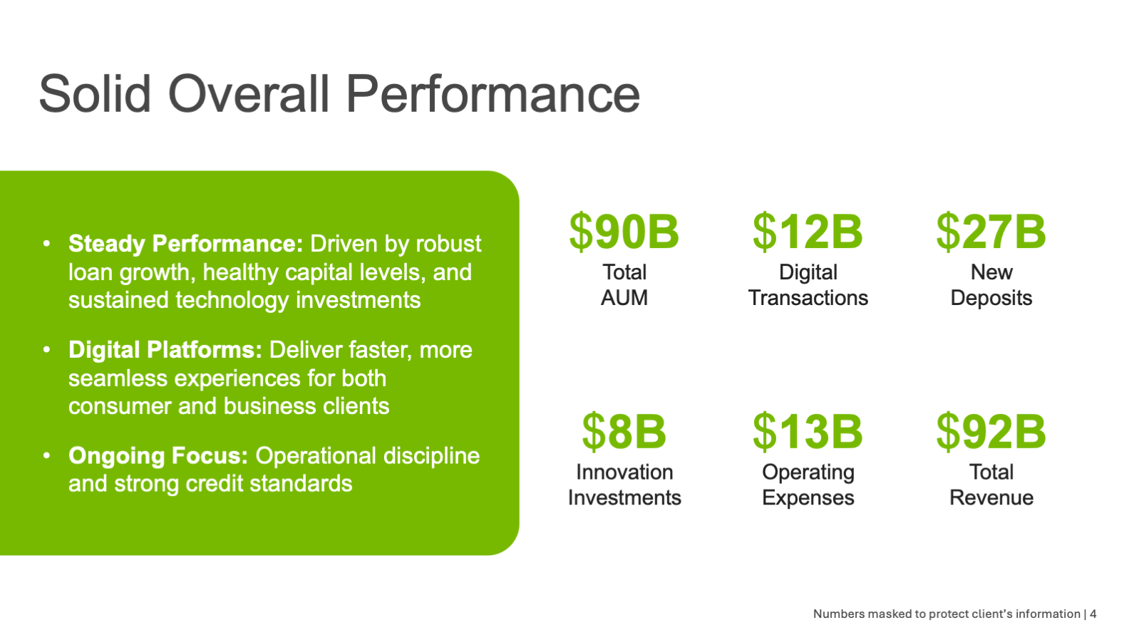
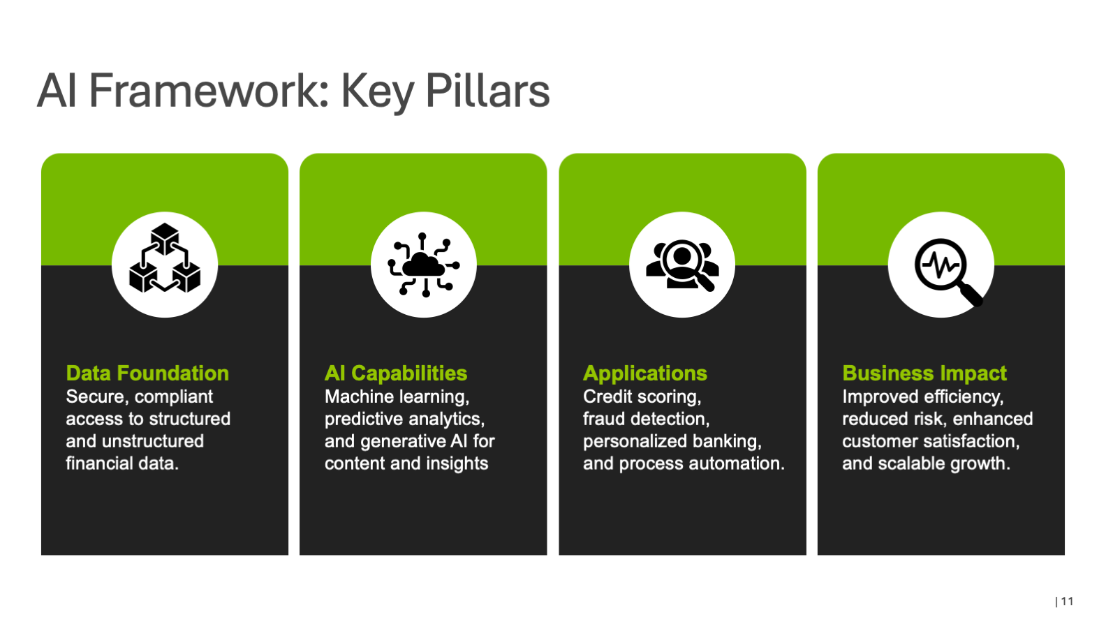
The deck opens on the market, sizing the opportunity before anyone reports a result, so the quarter has context to sit in. From there it moves to company-wide performance, hands off to the four business units in turn, then shifts from results to capability with the AI framework, and closes on what Q3 means for Q4. Context, then proof, then direction.
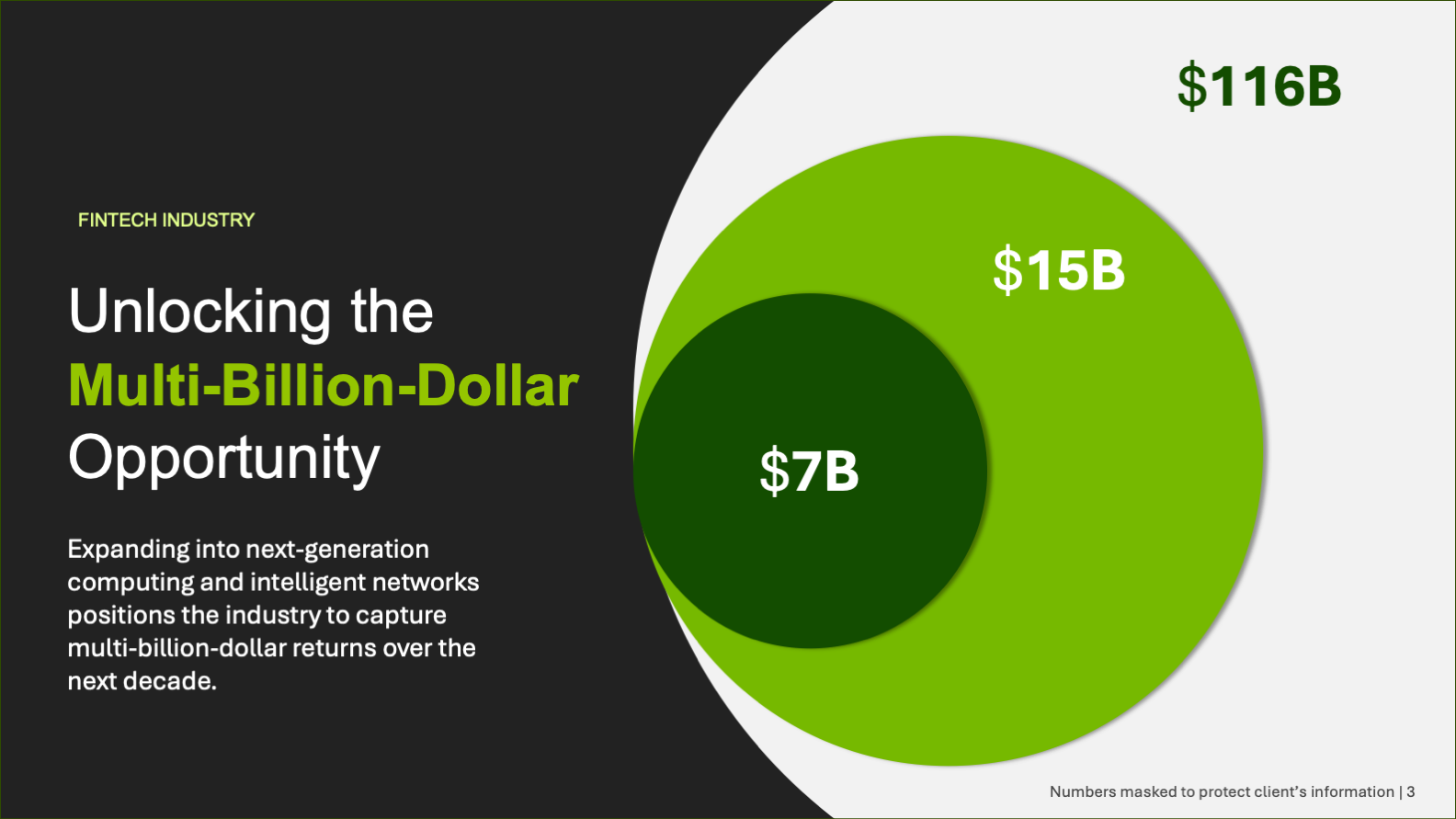
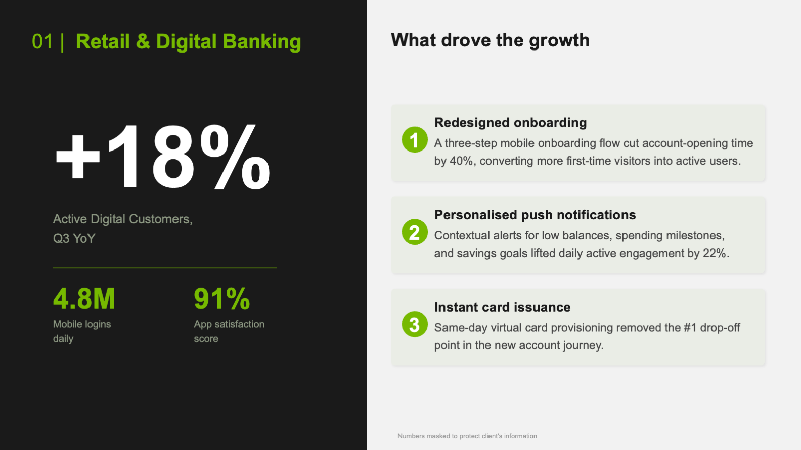
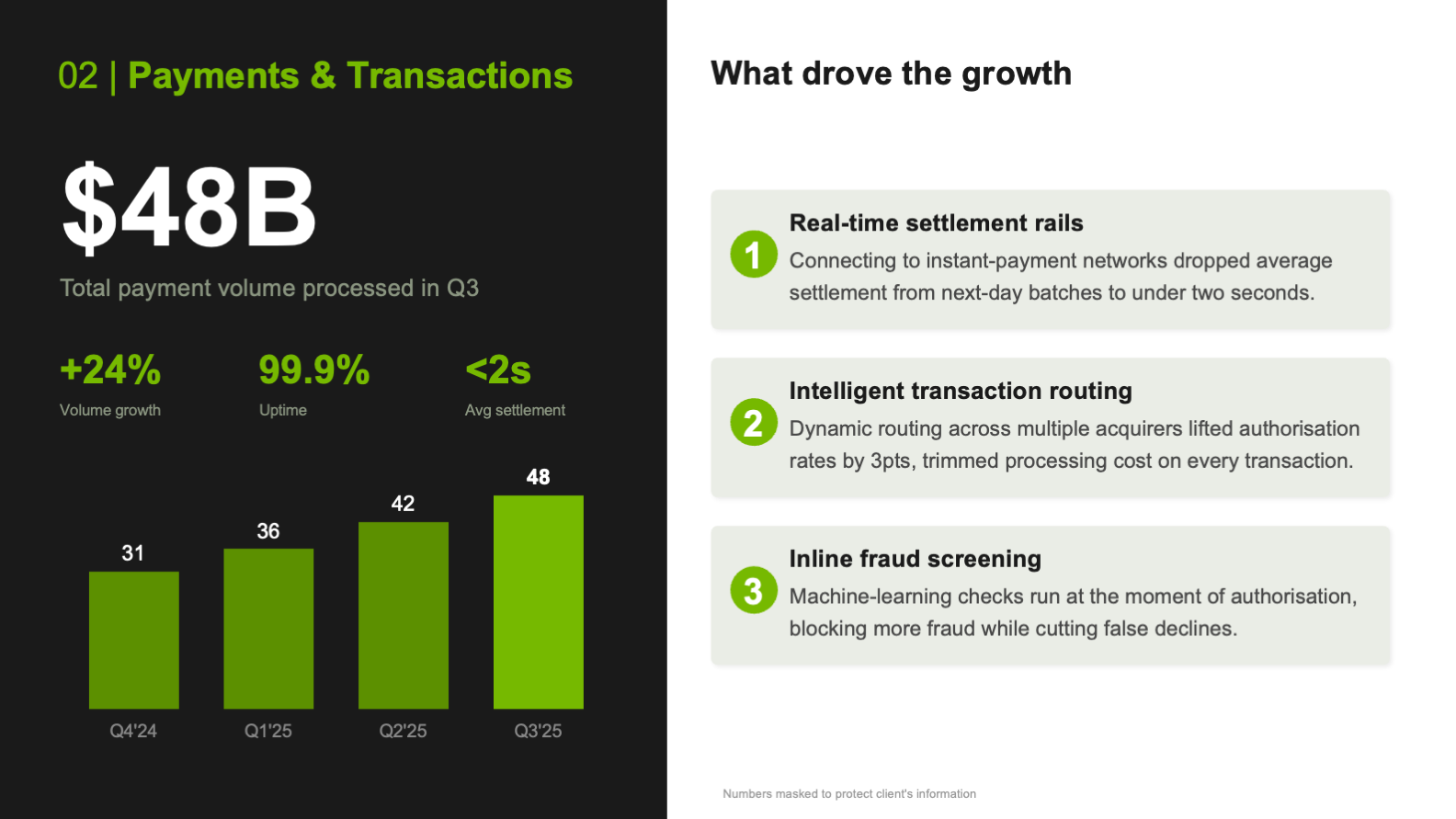
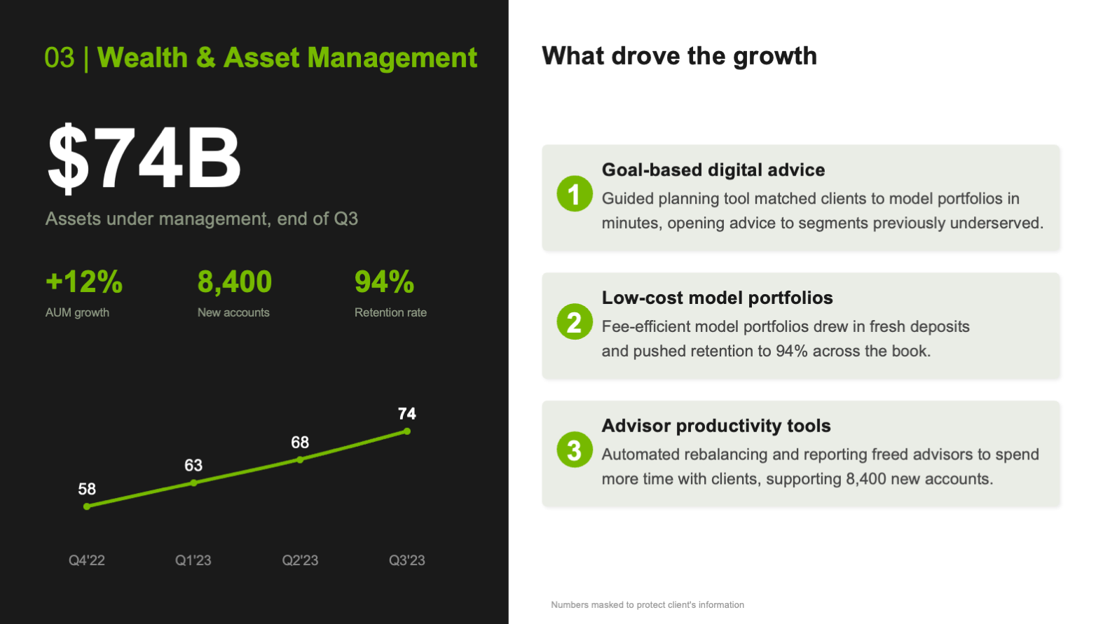
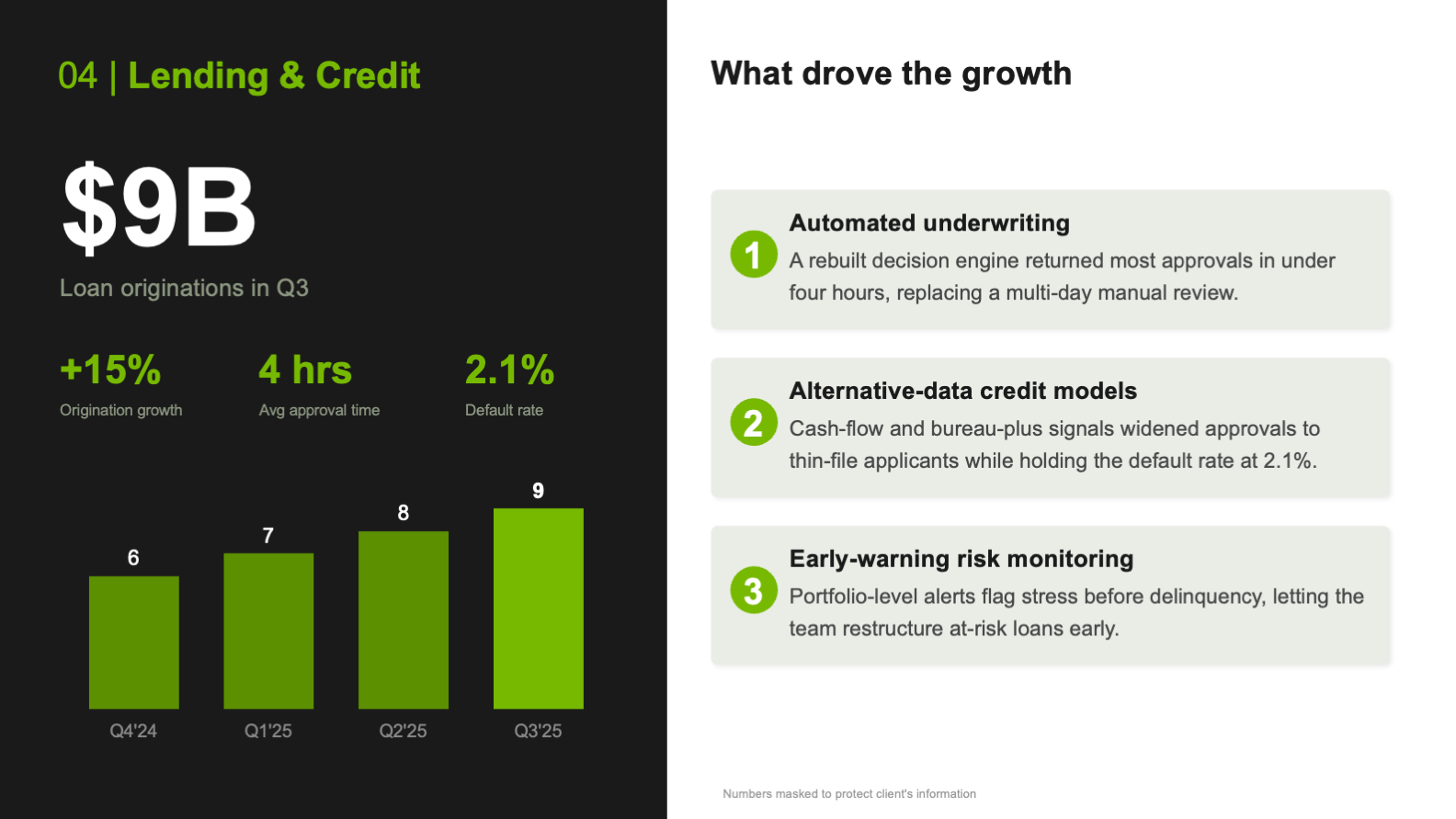
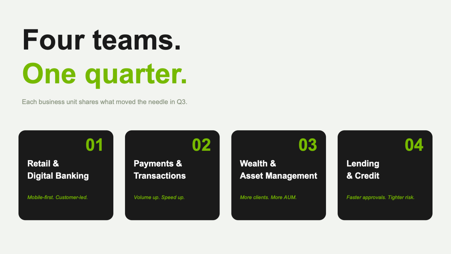
The business-unit system
Four units had to report in a row without the deck feeling like four different decks. The fix was one template: a dark panel carrying the headline number and supporting stats, a light panel explaining what drove them, and a data visualization sized to each unit's story. The architecture holds steady while the content flexes, so the room reads each unit faster than the last.
The visual system
A near-black and bright-green palette with clean off-white space gives the deck its fintech-forward read, while bold sans-serif type and generous spacing keep it credible and easy to scan. The high-contrast color blocking is deliberate on two fronts: it makes the system feel current, and it was checked for accessible contrast so the slides hold for every reader in a mixed, neurodiverse room.


Twelve slides, four units, one argument, and no frame asking a reader to work harder than the meeting allows.
From Raw Quarter to Town Hall
The deck came together in three passes, each one protecting the clarity of the last, so a dense quarter reads as one clean story.
Edit the Quarter
narrative spine
units in order
Build the System
unit template
contrast target
Design the Data
stock charts
slides
- A narrative arc from market context to next-quarter direction
- One plain-language takeaway anchoring every slide
- A repeatable unit template that scales across four business units
- Custom data visualization for every key figure
- An accessible, high-contrast system tuned for a mixed audience
A town hall is not read the way a team meeting is. The room is broad and its fluency is uneven, so every choice, from the single-takeaway headlines to the contrast-checked color blocking, was made so the argument survives that range and still lands with the weight a quarterly review needs.
What the Design Achieves
The deck takes a quarter most companies present as a data dump and makes it readable in one pass, for the whole room. It gives every business unit a frame that flatters its results, gives the audience a single story to follow, and ends on a clear read of what comes next.
Because it runs on a system, a spine, a unit template, and an accessible palette, the deck also holds up as a model. The same structure could carry next quarter, or any recurring company-wide update, without rebuilding from scratch.
- A dense quarter made readable in a single pass
- Four unit reports resolved into one company story
- Numbers framed to land before the detail
- A close that points forward instead of looking back
- Contrast and color that hold for a neurodiverse audience
- Executive storytelling that turns a recap into an argument
- Data visualization and information design built for a point
- A repeatable slide system rather than a set of one-off frames
- Accessible, inclusive design folded into a brand-forward look
- Tone control for a broad, mixed-fluency audience