The Driest Deck in the Building, Presented by Everyone
Data governance is some of the least glamorous material an organization has to present, and some of the hardest to get people to adopt. Lifecycle models, RACI charts, maturity levels. All necessary, all dense, all easy to make unreadable.
It is also presented by a lot of different people. A lead steward briefs executives, a domain owner walks their own team through the same program, an analyst reports the metrics up the chain. Hand that responsibility around without a system and every deck drifts: different layouts, different colors, different logic, until the program looks as disorganized as the data it is trying to govern.
The job was to build one system disciplined enough that anyone could populate it, where the result still looked and read like a single, coherent program no matter who assembled it.
- A ready-made layout for every part of a governance program
- Dense content like RACI and lifecycle made genuinely legible
- Consistency that survives being filled in by non-designers
- One look that works for an exec audience and a working team alike
- A way to re-skin the deck for a department without rebuilding it
- Every steward rebuilds the same slides a slightly different way
- Layouts, colors, and logic diverge across teams over time
- Technical content collapses into walls of text and stock charts
- The program reads as inconsistent, which undercuts its authority
- Each new deck starts from a blank slide instead of a standard
The real deliverable was not a deck. It was a standard, designed to stay intact in hands that are not trained to keep it that way.
Four Rules for a System Others Will Run
A template system only works if it holds up after it leaves your hands. Four principles kept it durable, usable, and hard to break.
Every layout shares the same grid, type scale, icon style, and color logic. A slide pulled from the front of the deck and one from the back read as the same system, so consistency is the path of least resistance rather than something a user has to work for.
Placeholder names, sample data, and clear prompts make it obvious what goes where. The system anticipates being filled in by someone in a hurry, so the right move is also the easy move, and the design survives the handoff.
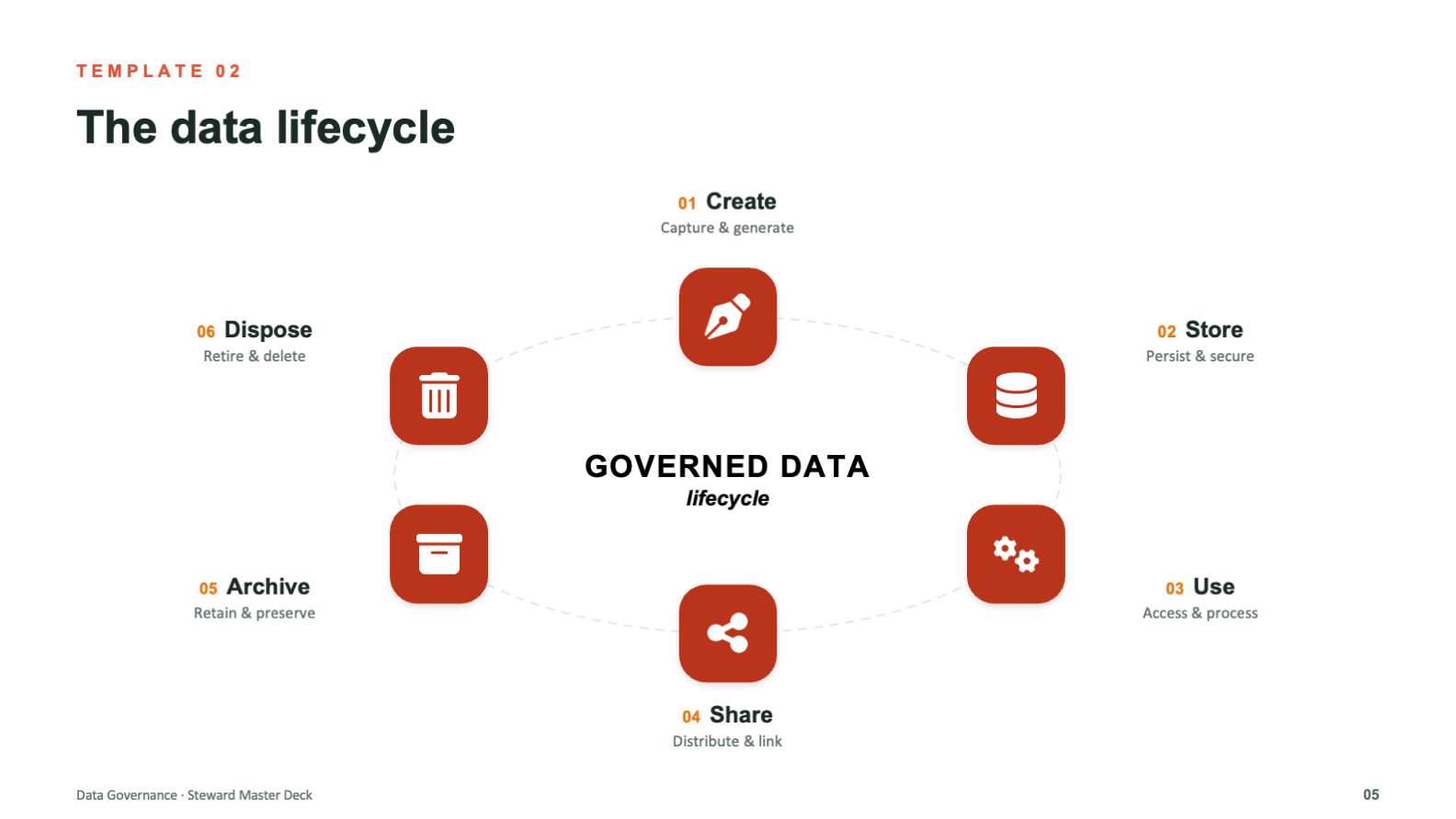
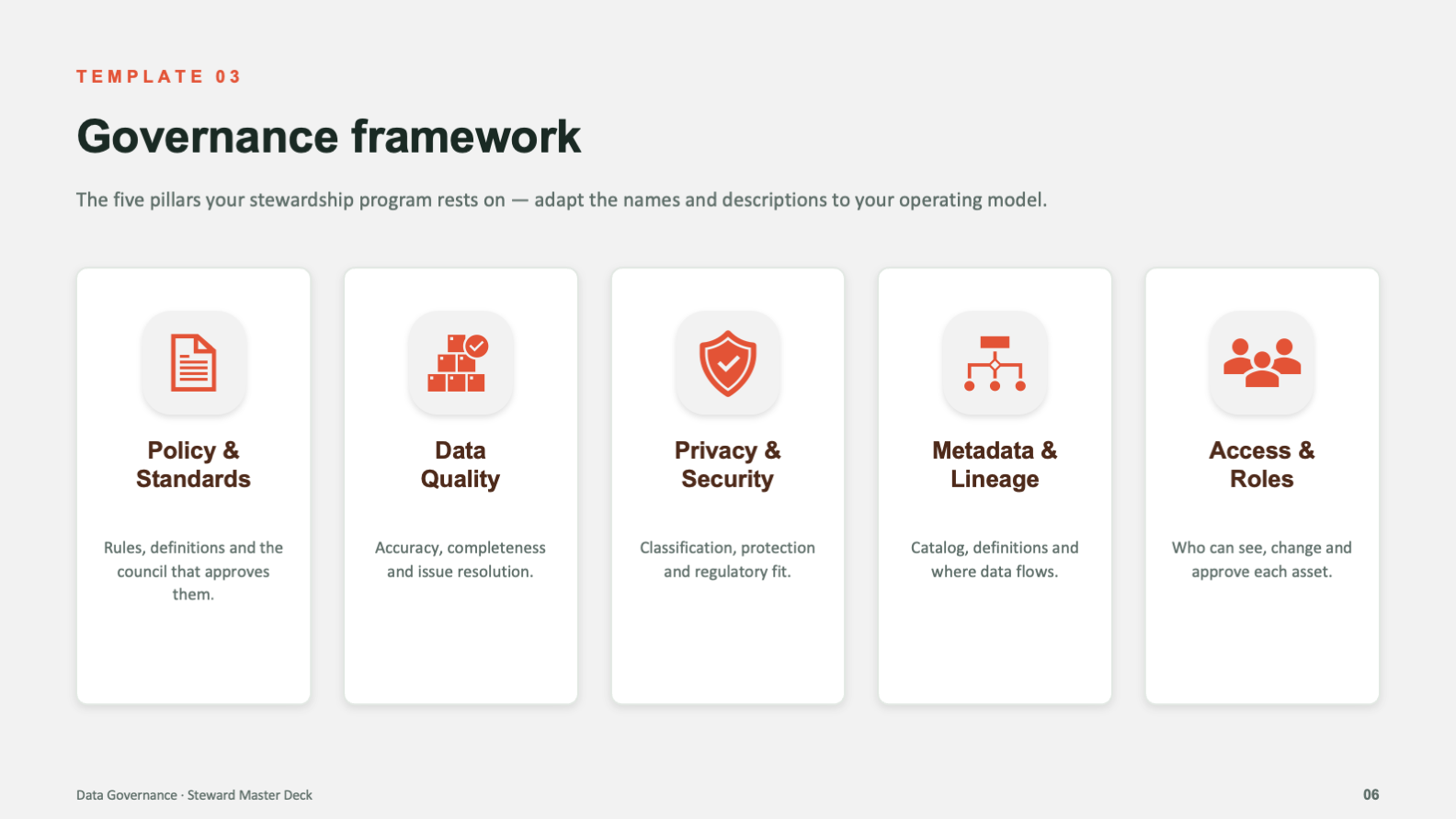
Lifecycle, framework, roles, accountability, roadmap, metrics, and maturity each get a purpose-built layout. Because every part of the program already has a home, no one has to improvise a slide from scratch and break the system doing it.
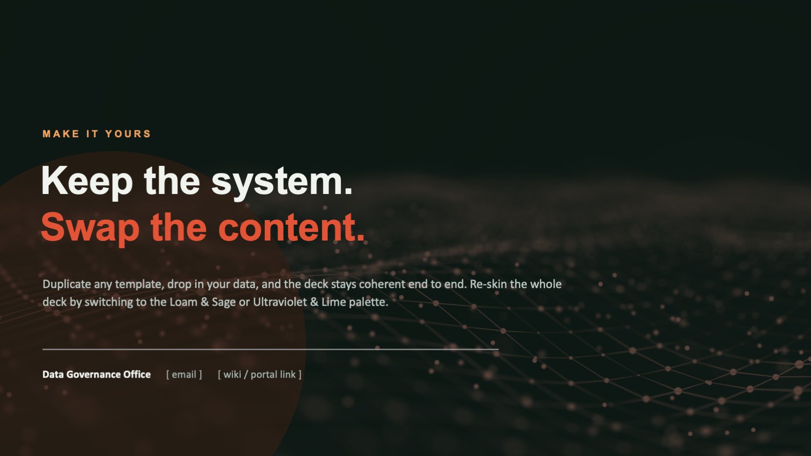
Palettes swap the entire deck's look in one move while the structure stays exactly the same. A department can make it theirs without touching a layout, so flexibility never comes at the cost of consistency.
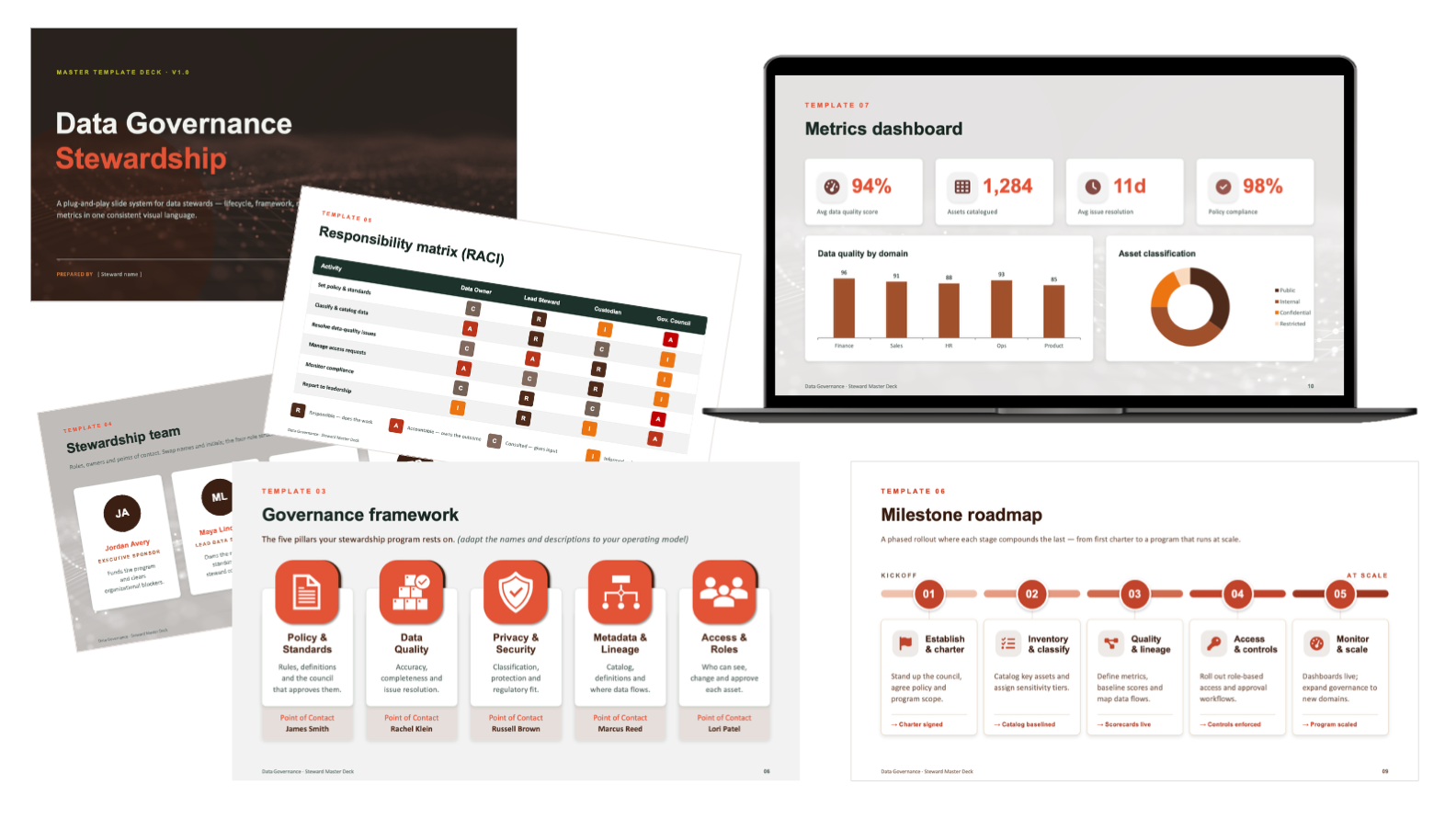
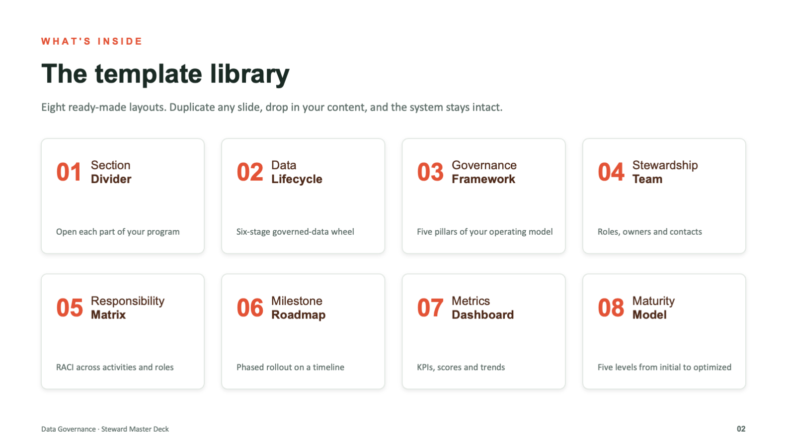
The Template Library
The system was mapped before it was styled. Every part of a governance program that needs a slide got its own reusable layout, and all of them were built on one shared visual language.
Eight layouts, one language
The library opens with a contents slide that doubles as a map of the system. Section divider, data lifecycle, governance framework, stewardship team, responsibility matrix, milestone roadmap, metrics dashboard, and maturity model. Duplicate any one, drop in your content, and the design holds.
Built for the hardest content
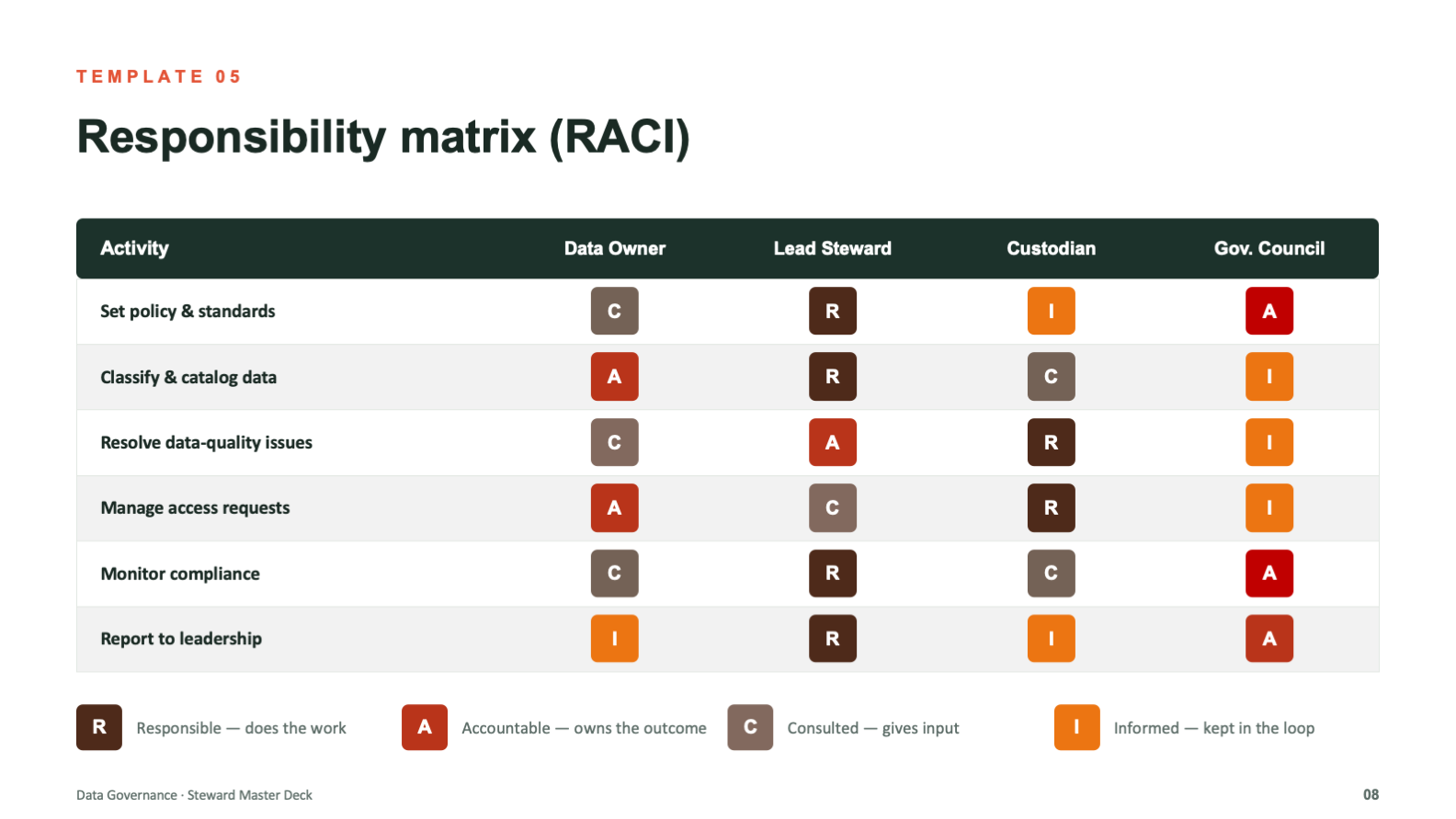
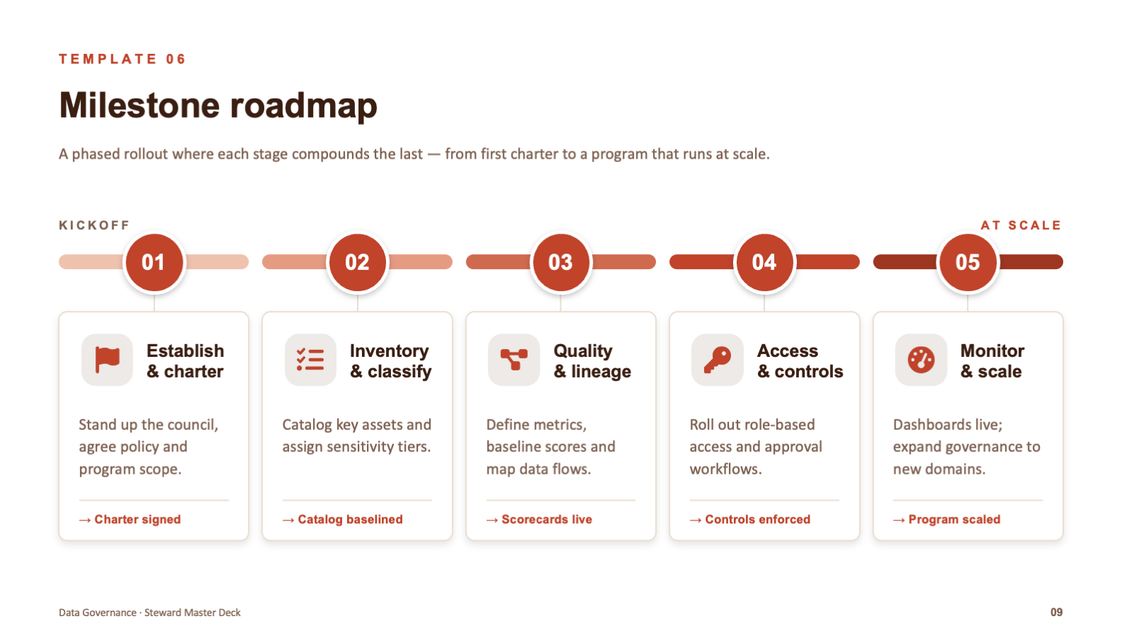
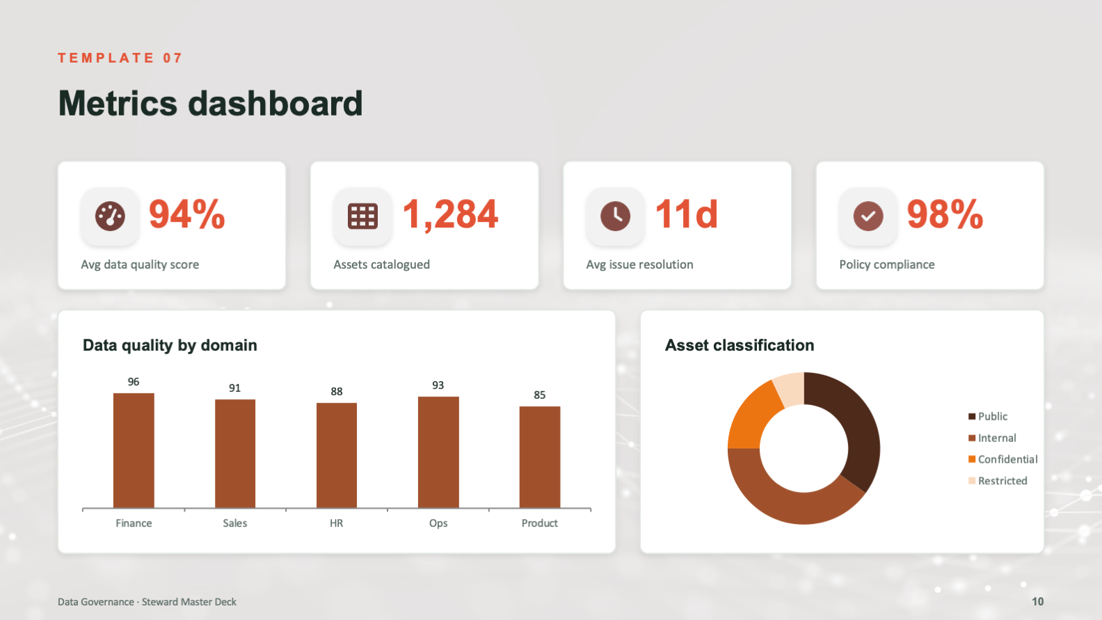
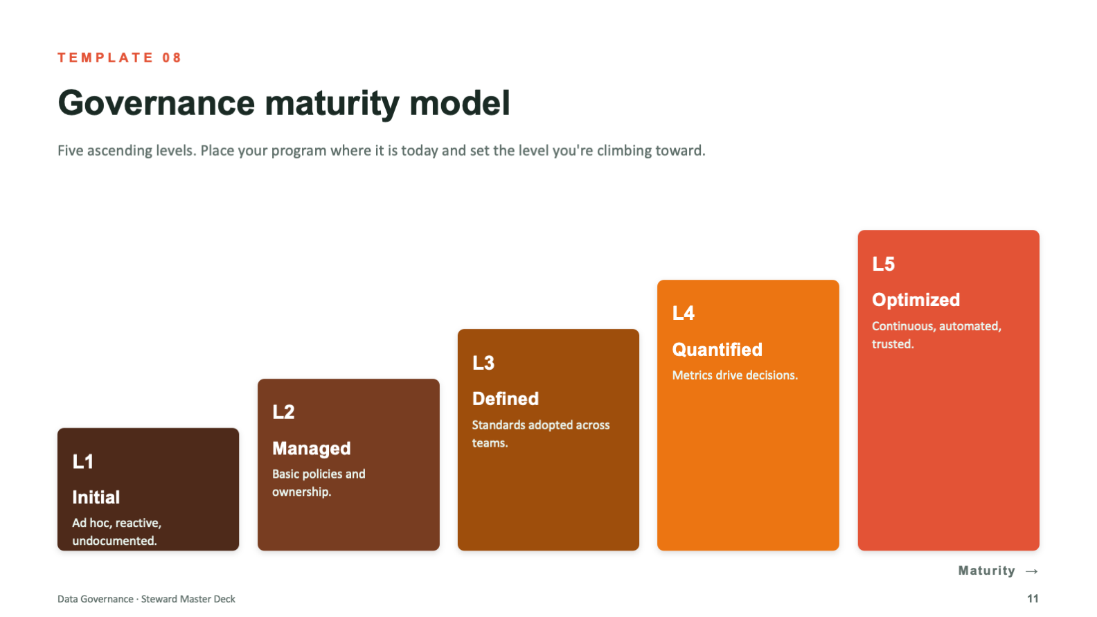
The dry material is where design earns its keep. Each dense concept was turned into a purpose-built diagram, a circular lifecycle, a five-pillar framework, a color-coded RACI, a phased roadmap, a metrics dashboard, and a maturity ladder, so the structure of the idea is visible at a glance instead of buried in text.
Eleven slides, eight layouts, one language. The system does the design thinking so the next person does not have to.
From Topic to Toolkit
The system came together in three passes, moving from the shape of the program to a deck others could run on their own.
Map the Program
layouts planned
program mapped
Design the Layouts
visual system
icon family
Make It Yours
palette skins
rebuilds needed
- Eight reusable layouts covering every part of a governance program
- One consistent visual language across all eleven slides
- Custom diagrams for lifecycle, framework, RACI, roadmap, and maturity
- Placeholder content and prompts that make the deck self-explanatory
- Three palette skins that re-skin the deck without breaking structure
The user is not in the room when the deck gets reused. Every decision, from swap-ready placeholders to palette skins that cannot touch the grid, was made so the system stays coherent in the hands of someone who will never think about design at all. That is the whole point of a system.
What the System Achieves
The library turns governance communication from a recurring design problem into a solved one. Instead of rebuilding the same slides from scratch, a team duplicates a layout, drops in their content, and ships something coherent and on-brand in minutes.
Because consistency is built into the system rather than left to discipline, the program presents as one organized whole across every team and audience that touches it. The design holds whether it is an executive briefing or a working session, and whether the person presenting is a designer or has never opened a style guide.
- One coherent look across every team and audience that uses it
- Dense governance content made legible at a glance
- Faster decks, since every part of the program already has a layout
- On-brand output even from people with no design training
- Easy re-skinning that adapts the deck without fragmenting it
- Design systems thinking applied to presentation, not just brand
- Information design that makes dry, technical content readable
- Custom data visualization and diagram design at a system level
- Template architecture built for reuse, scale, and handoff
- The judgment to design for the next user, not just the first one