Two Jobs, One Deck
This deck leads two lives. In the quarterly meeting it is a talk-track: the relationship manager presents from it, and the numbers have to be big and clear enough to anchor a conversation. Afterward it is a leave-behind: the plan sponsor's committee reads it with no one there to narrate, and every slide has to make its own case.
Most review decks are built for only one of those jobs. A pure talk-track goes sparse, a few words a presenter fills in, and means little once the meeting ends. A pure document goes dense, every detail crammed onto the slide, and is miserable to present from. This deck could not pick one.
The subject made it harder. Retirement-plan data, plan-health indices, market benchmarks, engagement by age and device, communication counts, turns into a wall of numbers the moment you stop editing. The work was to keep the substance a plan sponsor needs and still let each slide read in a single pass.
- Present live, with headline numbers that anchor a conversation
- Stand alone for a committee reading it weeks later
- Make dense plan data scannable for a non-specialist audience
- Hold one consistent brand system across every slide
- Cover a full quarter without turning into a data dump
- A sparse talk-track that says nothing on its own
- A dense document no one can comfortably present from
- Tables and charts that read as a wall of figures
- A palette that drifts from one slide to the next
- A recap that stops at what happened and never reaches what is next
The deck had to be presentable and readable at once, for a client audience that does not live in the numbers.
Rules for a Deck That Does Double Duty
A review like this is presented once and read many times. Four rules kept it working in both modes.
The figure that matters is the largest thing on the slide. A presenter can talk over it and a later reader gets the point at a glance, no caption required.
Subtitles, short explainers, and footnotes give each slide the context a presenter would have added out loud, so the deck still makes sense with no one in the room.
The firm's red, a graphite near-black, a quiet gray, and white space, used the same way throughout. Twelve different layouts still read as one deck because the color logic never changes.
Each section says why a figure matters before it shows it, so plan health, benchmarks, and engagement land as a story rather than arriving as homework.
How the Review Is Built
Structure first, surface second. The quarter was edited into an arc a plan sponsor could follow before any slide was styled.
The narrative spine
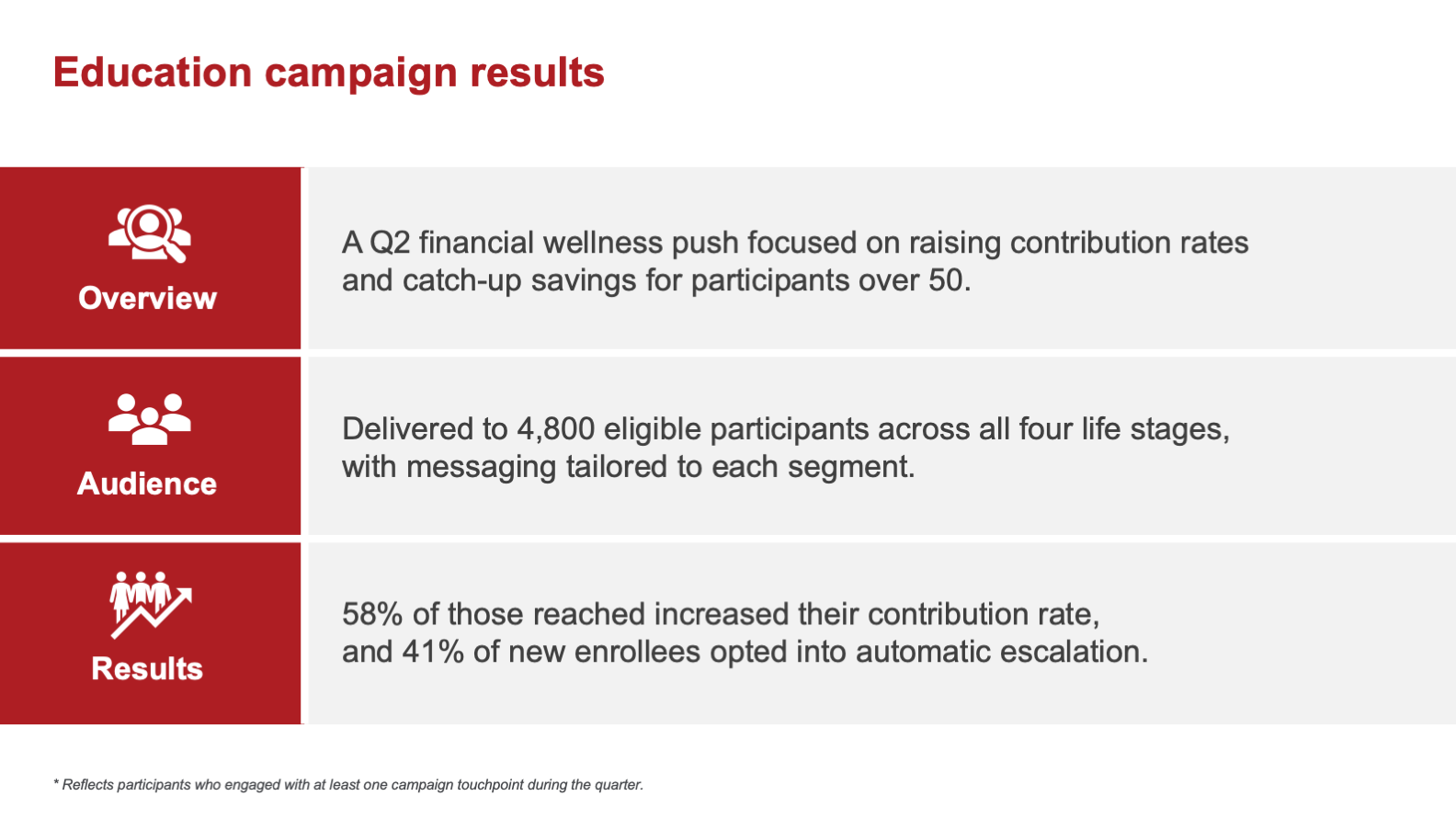
The deck opens on the people, the service team looking after the plan across every life stage, then sets the agenda. From there it moves through plan health and market context, into how participants are actually engaging by age and by device, then to what the team did for them this quarter through education campaigns and communications. A short security reminder, the quarter's key insights, and a close on next steps. Relationship first, then proof, then direction.

The recurring layouts
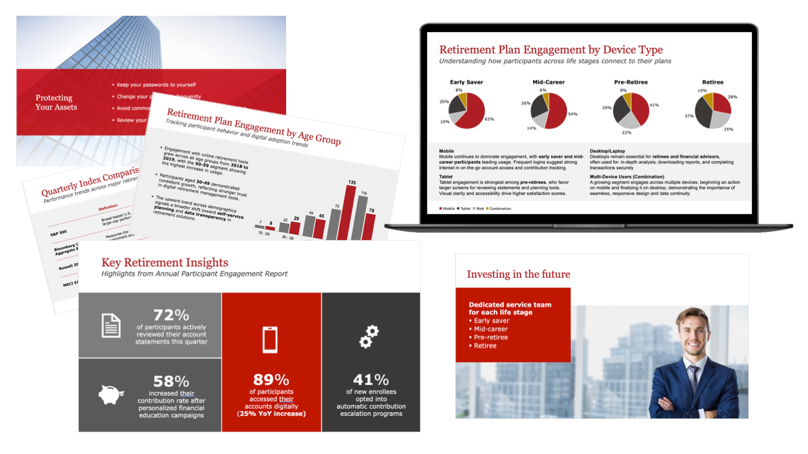
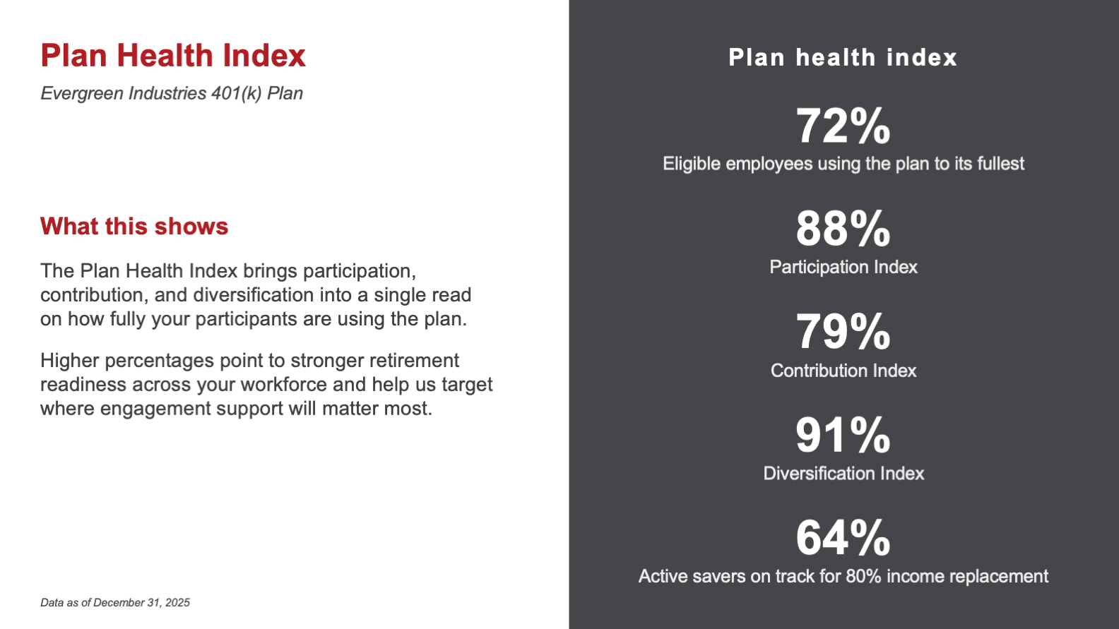
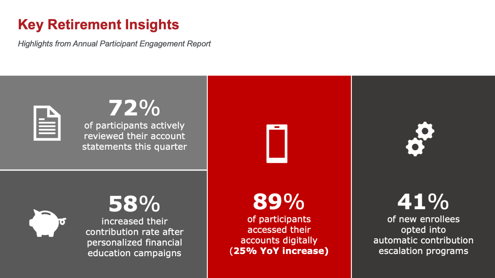
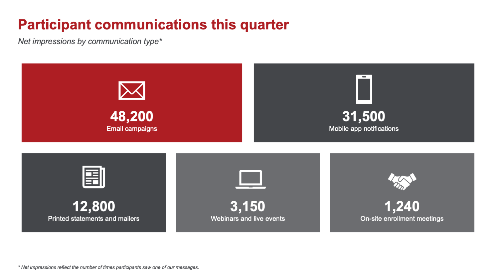
A quarter's worth of different content, indices, stats, results, counts, had to feel like one deck. The fix was a small set of layouts used over and over: a dark panel for headline metrics, color-blocked grids for stat callouts, a label-and-content row for narrative results, and a clean frame for tables and charts. The architecture repeats, so the reader learns it once.
Data designed to be read, not decoded
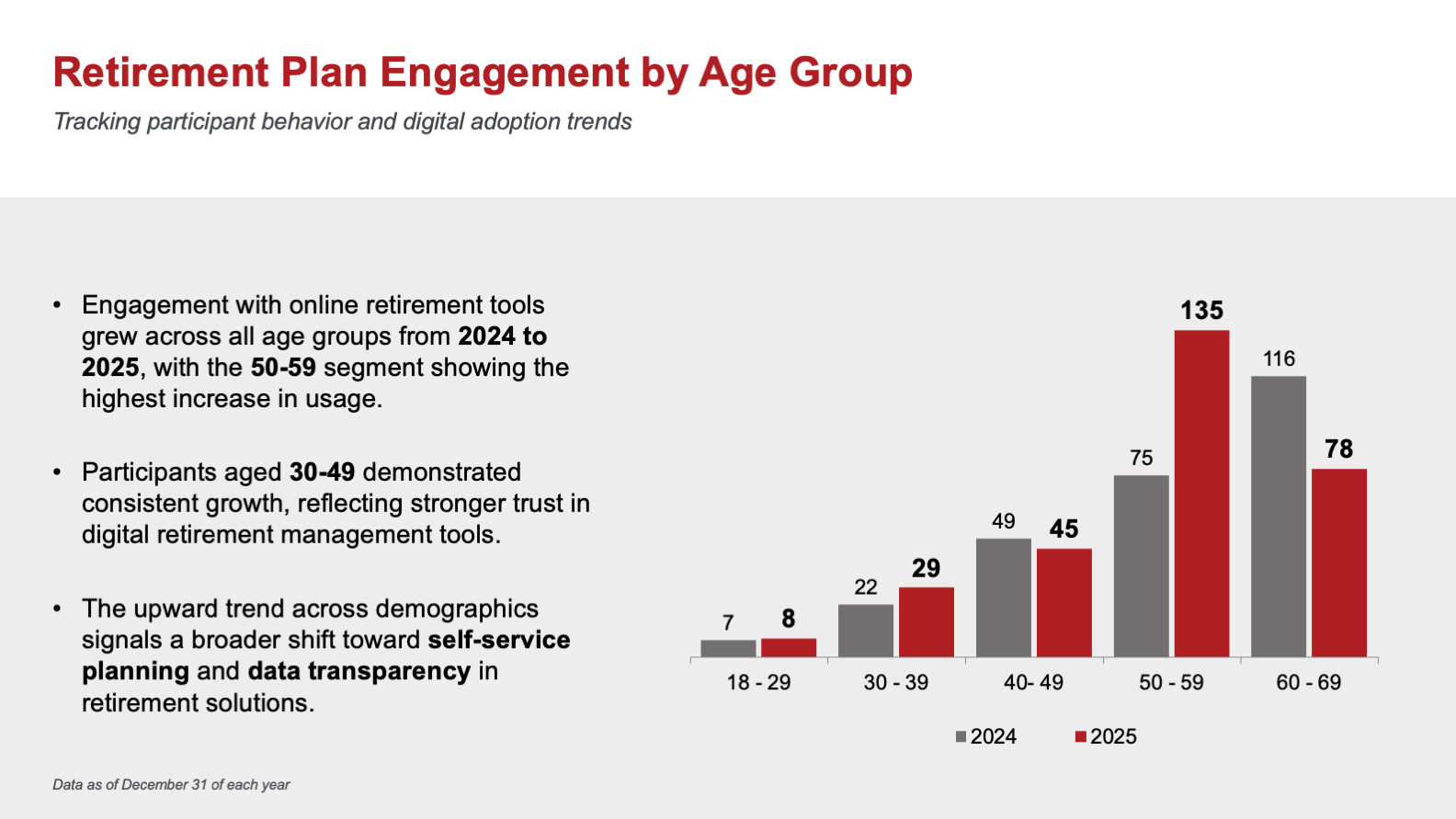
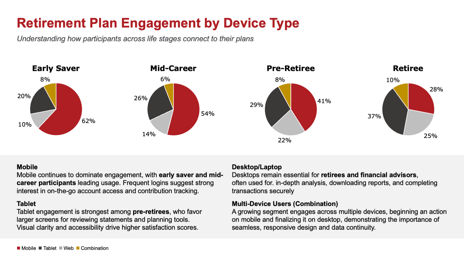
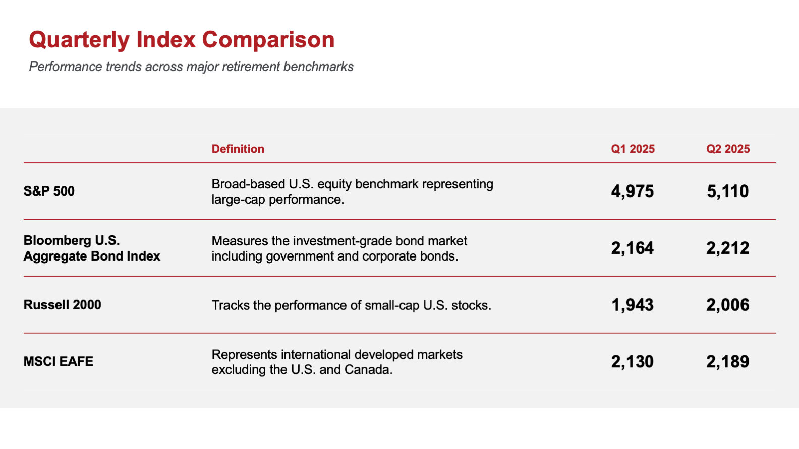
The figures that carry the most weight got purpose-built visuals rather than tables. Engagement by age is a paired bar chart that shows the year-over-year shift at a glance, engagement by device is a row of pies read across life stages, and the benchmark table is stripped to definition and two quarters so the comparison is the only thing on the slide.
The frames around the data
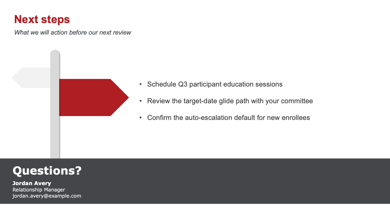
The slides that are not data still earn their place. The agenda promises a path, a security reminder speaks directly to participants, and the close turns the meeting into action with named next steps and a way to reach the relationship manager.
The visual system
One palette does the cohesion work: the firm's deep red, a graphite near-black, a quiet gray, and white space. A serif red carries every title, Verdana carries the body, and the title treatment never changes. Because the color logic is fixed, the deck can hold a cover, a chart, a table, and a stat grid in the same twelve pages and still read as one document.
From a Lean Start to a Full Review
The deck grew from a short starting set into a full quarterly review in three passes, each one protecting the system so the additions never broke the whole.
Set the Spine
narrative arc
slides
Lock the System
palette
core layouts
Make It Stand Alone
ways to read
slides needing a presenter
- A relationship-first arc, from the service team to next steps
- Headline numbers sized to anchor a live conversation
- Enough built-in context to read as a standalone leave-behind
- Custom visuals for engagement by age and by device
- One palette and a repeatable layout set across twelve slides
A plan sponsor is not a markets analyst. The deck assumes a smart reader who does not live in the data, so every figure is framed before it is shown and every slide carries the one thing the sponsor needs to take away. The system flatters the firm's brand while keeping the meeting, and the document, easy to follow.
What the Design Achieves
The deck takes a quarter of plan data and makes it land in one pass, whether a relationship manager is presenting it or a committee is reading it later. It opens on the relationship, frames every number before showing it, and closes on what happens next.
Because it runs on a system, one palette and a handful of repeatable layouts, it also works as a template. The relationship team can refill it each quarter without rebuilding, and the same structure carries any client in the book.
- A quarter of plan data readable in a single pass
- One deck that presents live and stands alone afterward
- Numbers framed to land before the detail
- A relationship-first arc that closes on action
- A quarterly template the team can reuse client to client
- Client presentation design that does double duty
- Data visualization built to be read, not decoded
- A repeatable slide system on a tight brand palette
- Editorial judgment that turns dense data into a story
- Tone control for a client audience outside the numbers