ReminderX
back to UX projects main page
Overview
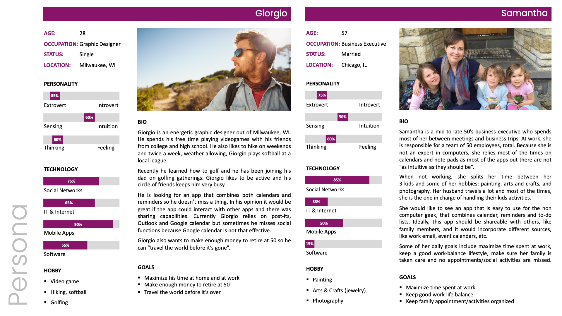
ReminderX is an all-in-one app that combines the benefits of 3 common, yet under developed, apps: calendar, reminder and to-do list. The goal is to develop a product that is very intuitive, easy to navigate, regardless of the user's technological skillset. The audience for this app is pretty broad, ranging from young professionals in their mid 20's to high-level executives in their late 50's. Currently, our biggest competitor is not another app, but the old-fashioned post-it as over 90% of people interviewed rely on those yellow stickies to remind them of what needs to be done on a daily basis. Last, but not least, ReminderX must be 100% WCAG compliant.
The Research Experience
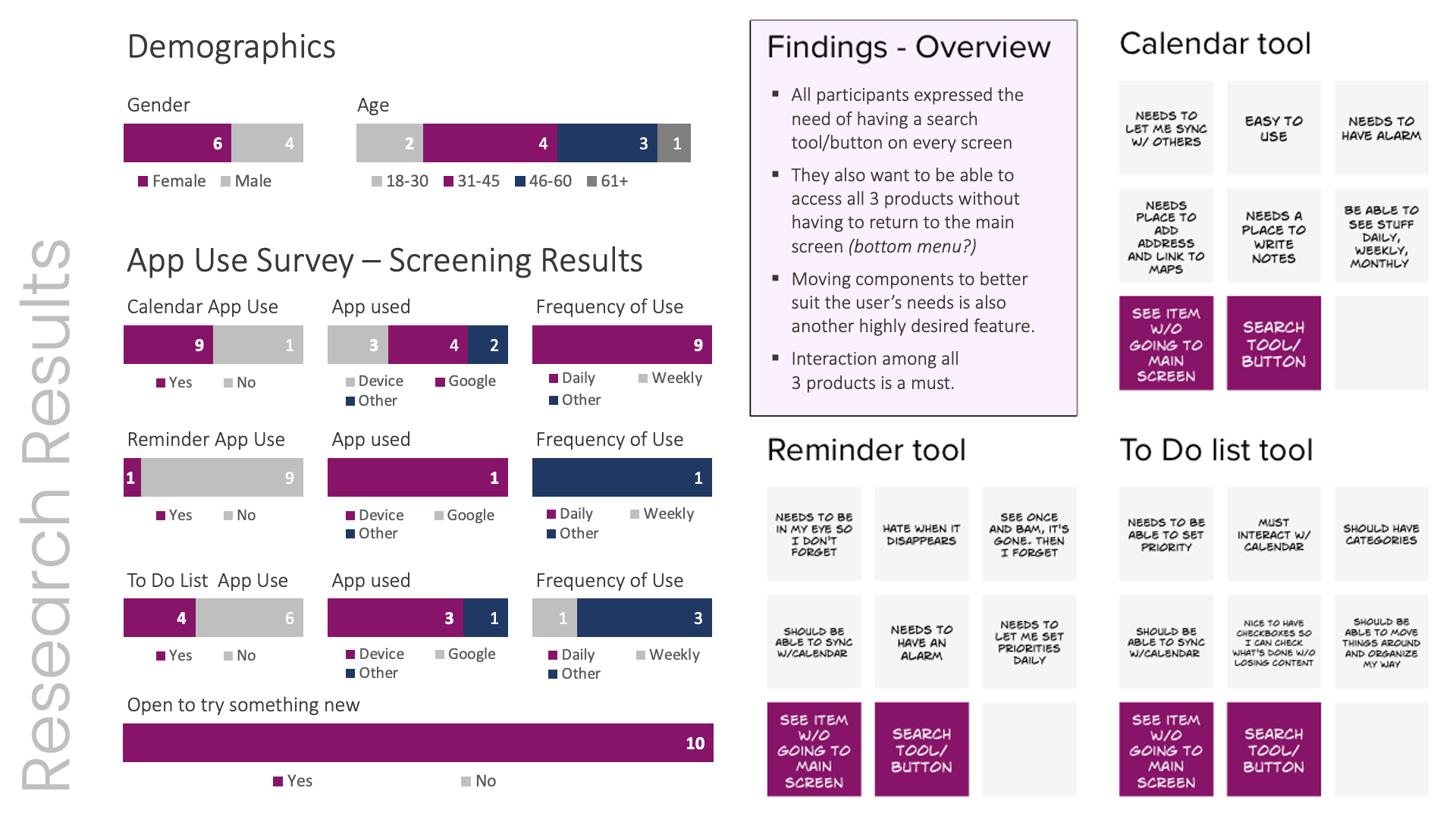
During the period of 2 weeks I interviewed 10 people from different ages and backgrounds to learn more about their daily habits and how ReminderX could enhance their lifestyle. As expected, pretty much every single person I interviewed relied on post-its to keep their to-do list and reminders up-to-date. When I asked why, 50% responded it was faster, 25% said by writing things down it's easier to remember, while the remaining 25% think the current reminding apps are not functional enough.
Design Approach
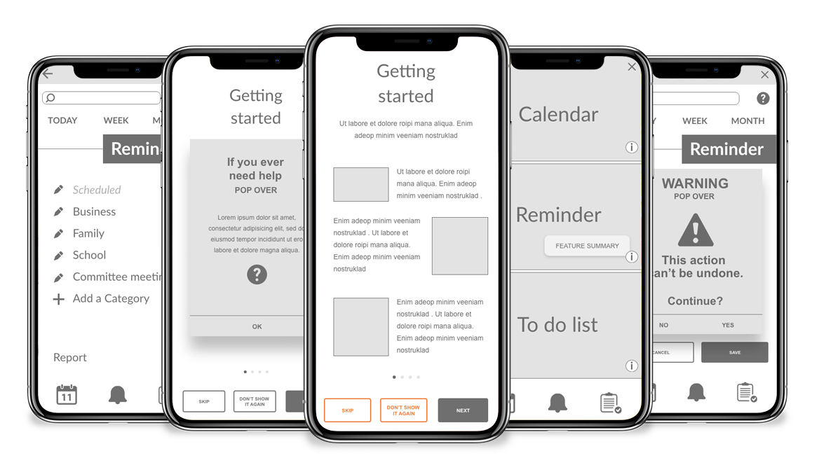
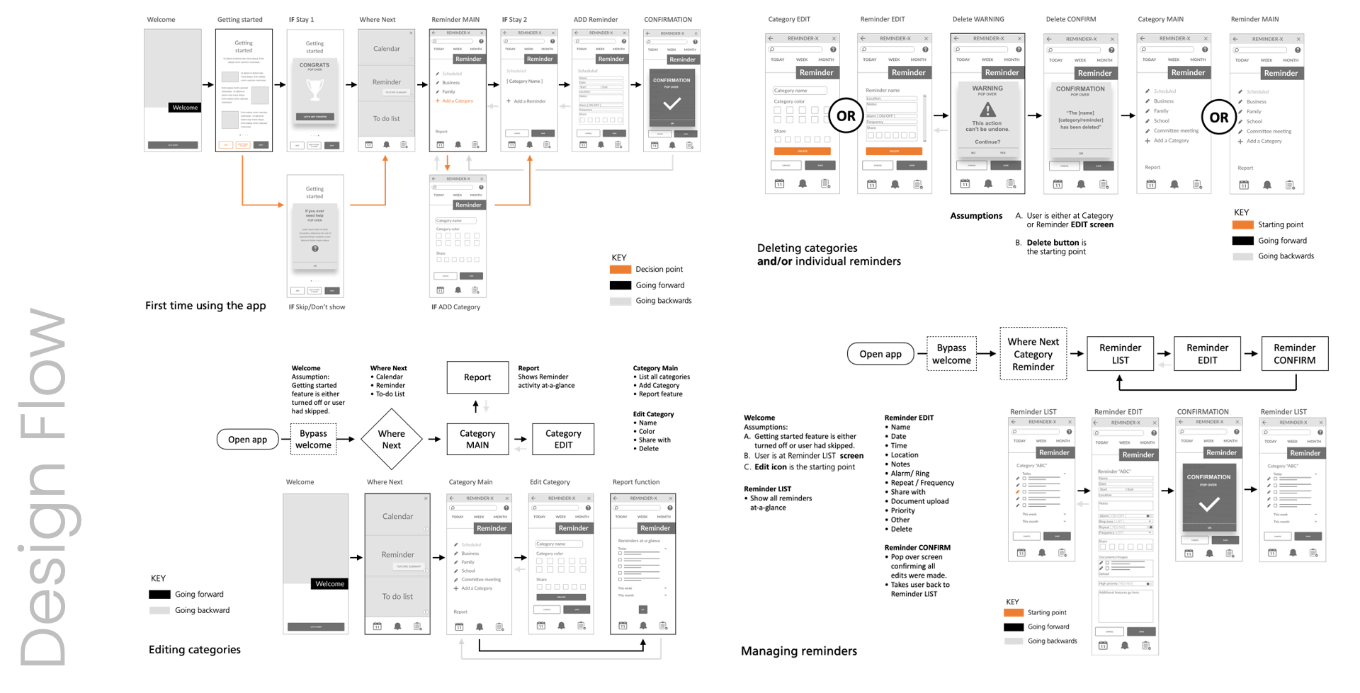
After interviewing a variety of potential users from different ages and backgrounds, I was able to get a better understanding of which features are expected to have at a MVP level, as well as how the app should function according to those potential users. One feature expected by all participants was the ability to "have all those 3 items on every screen so we don't have to go back and forth to the main screen". Other functionality related items asked to be present all the time were the search and the tip/help buttons. As a result, few wireframes were developed, as the ones shown below.
Prototype Development
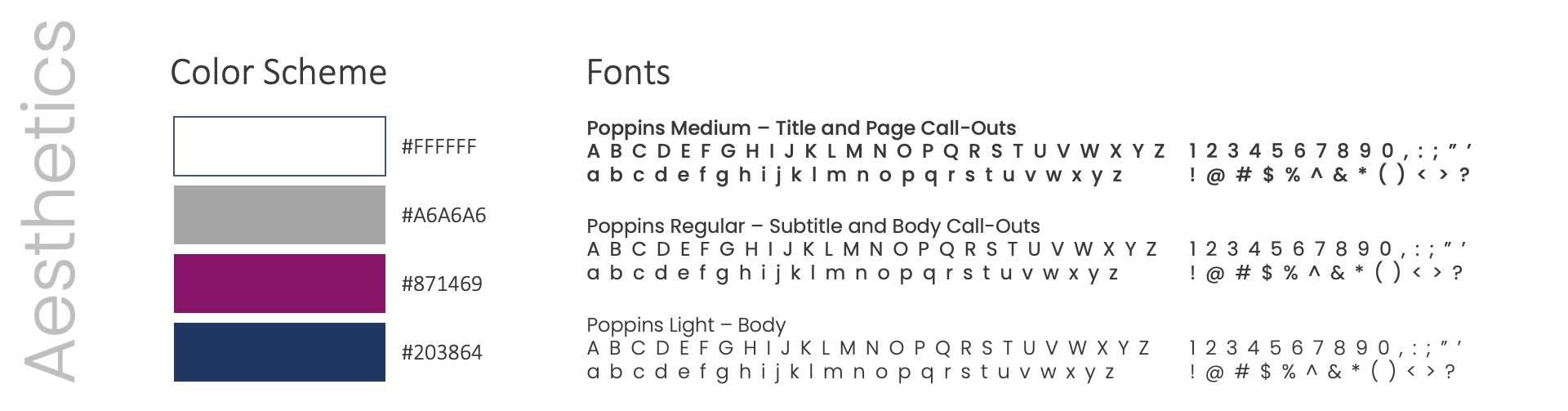
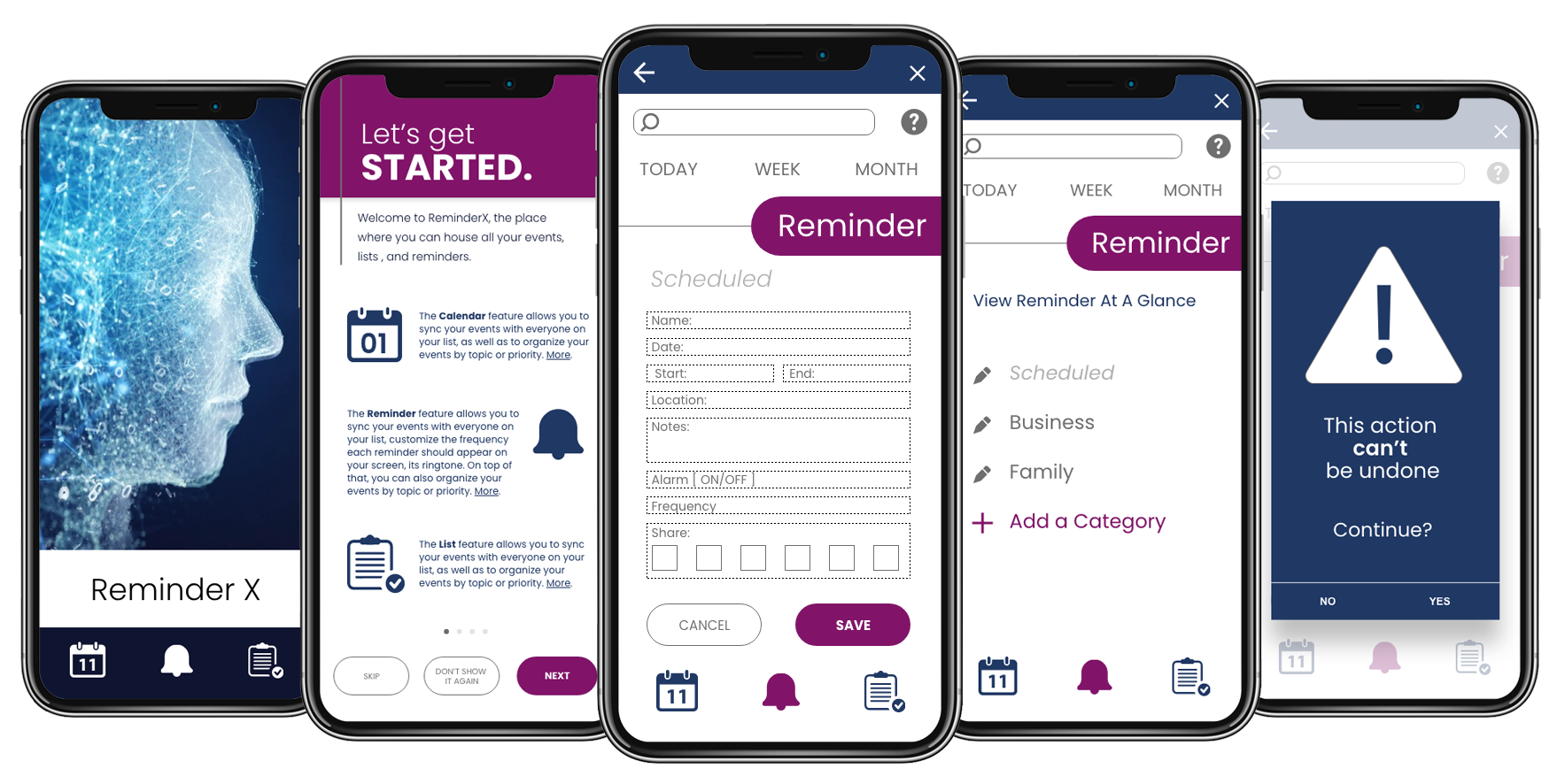
Once all the research findings were gathered and all existing questions answered, it was time to start developing the prototype. Aesthetics wise, the approach is fresh, clean, maximizing the use of white. A very deep blue will be used as our main contrasting color in lieu of black. It will soften the high contrast with the background. A warmer purple combined with a medium gray will be used as accent colors. The font face selection will come from the sans serif family to facilitate readability among all users.