Meals On Wheels
back to UX projects main page
Overview
Meals on Wheels is a cross platform, cloud based request form that allows town residents to apply for the Meals on Wheels service. Considering most of the Meals on Wheels users are adults over 75 years old, and many times, those users are also suffering from some type of impairment, creating a form that is WCAG compliant is a must. The ultimate goal is to develop a product that is very intuitive, easy to navigate, regardless of the user's technological skillset.
The Research Experience
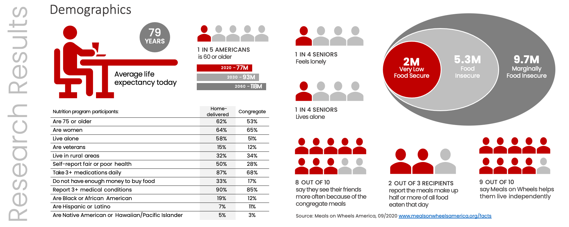
Because the time frame to complete this project was very short and it couldn't accommodate multiple one-on-one interviews, the user demographics was obtained using the data available on the Meals on Wheels America website. According to their website, our audience is anyone 60 years of age or older (or the spouse of a person 60 years of age or older) at risk of malnutrition, unable to come in to a Meals on Wheels People center for a meal.
Design Approach
While designing this form, there were two major aspects of design to be taken in consideration: accessibility and navigation.
1. Accessibility
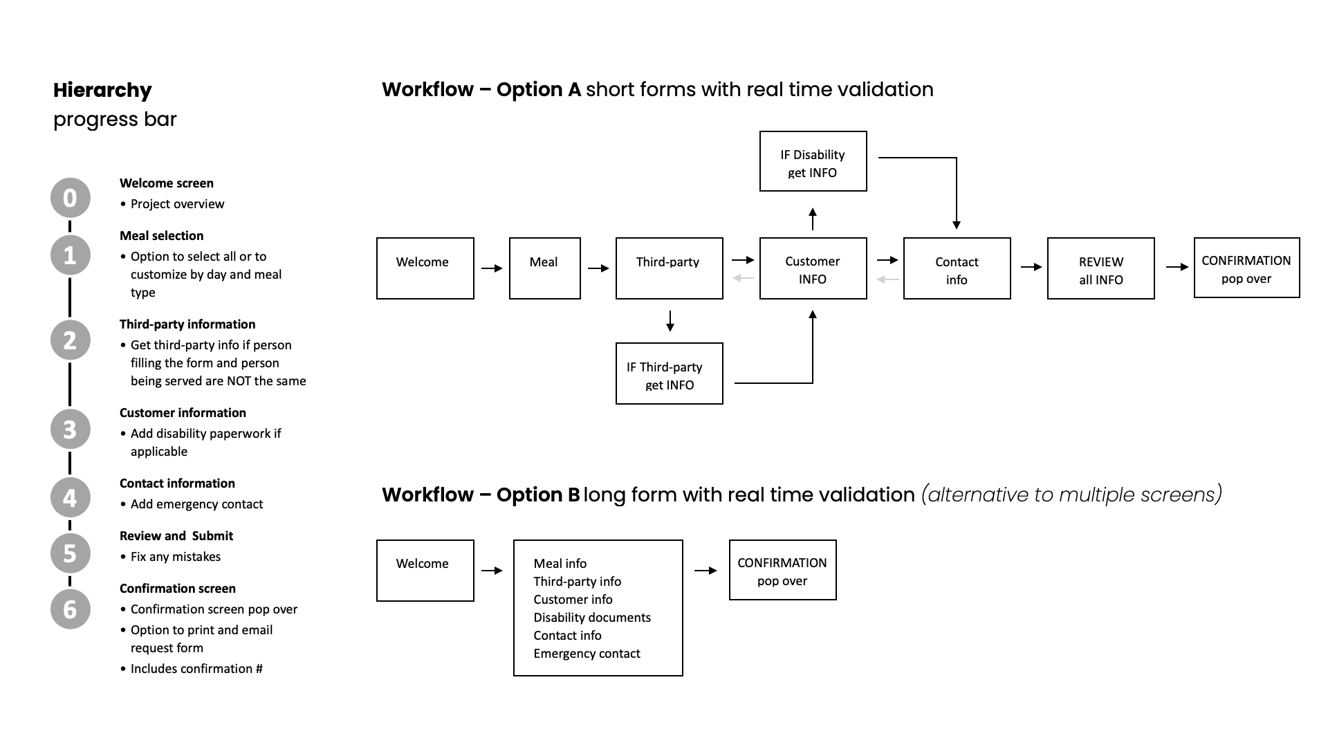
2. Navigation
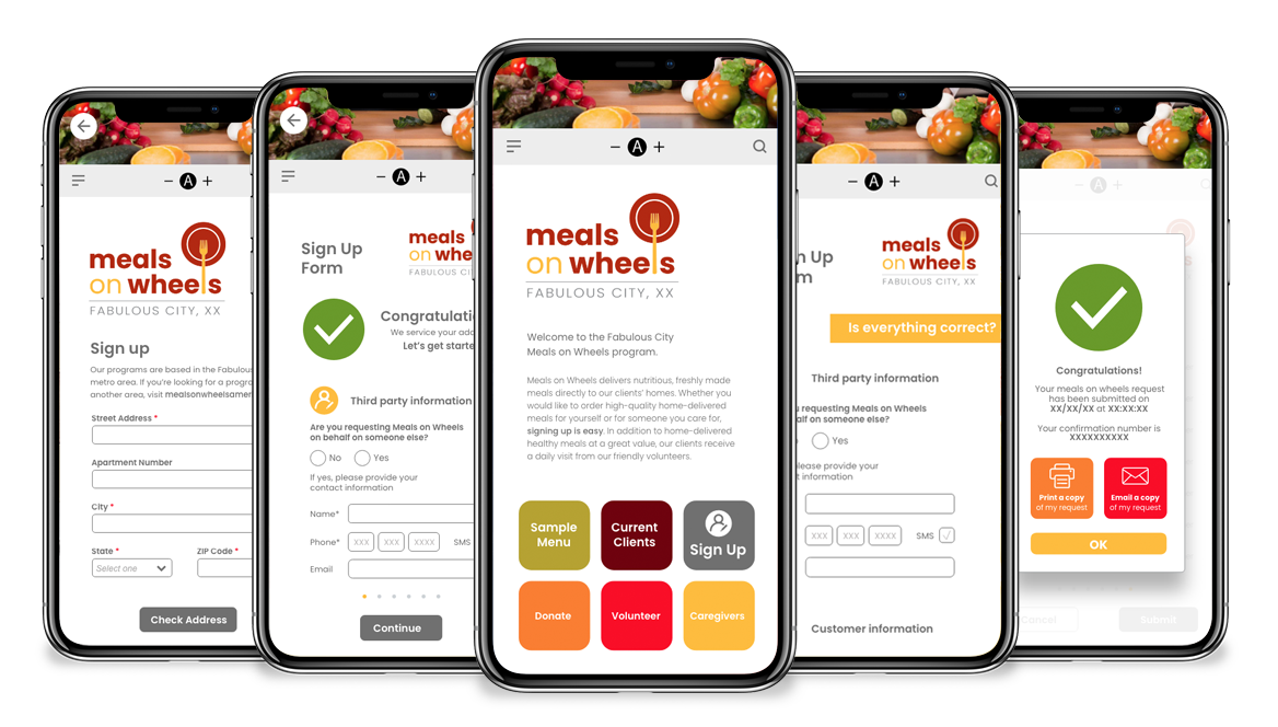
Prototype Development
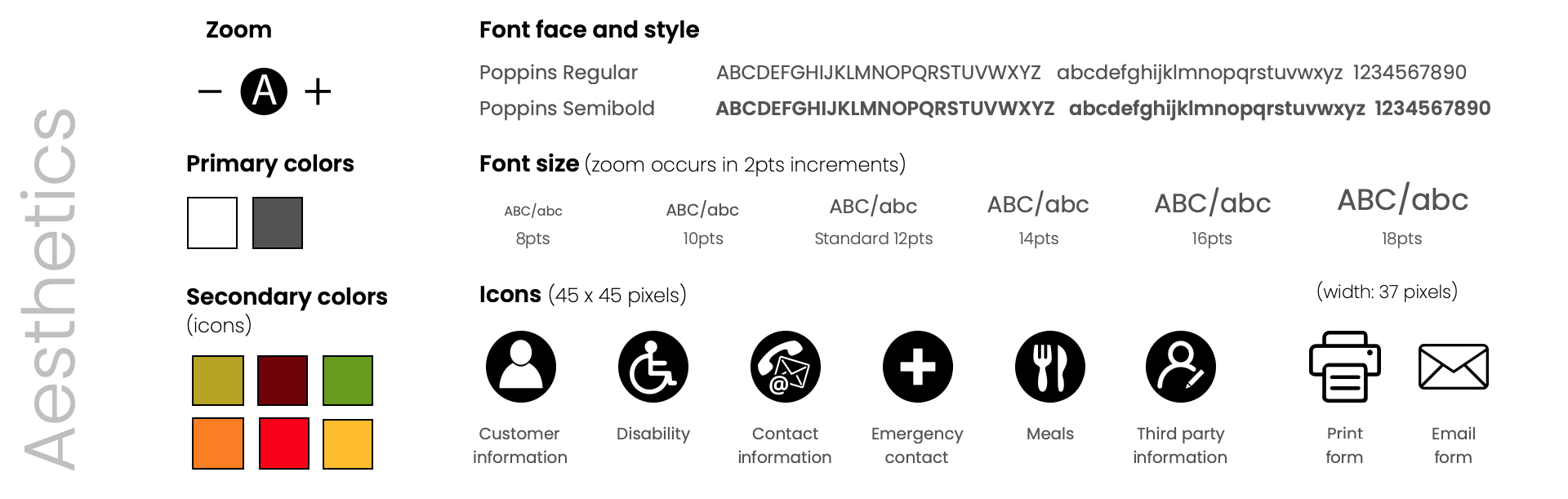
Once all the research findings were gathered, it was time to start developing the prototype. Aesthetics wise, the approach is clean, maximizing the use of white and bright colors. A dark shade of gray will be used as our main contrasting color in lieu of pure black. It will soften the high contrast with the background. A rich shade of maroon combined with warm tones of yellow and green will be used as accent colors. The font face selection will come from the sans serif family to facilitate readability among all users.
Lessons Learned
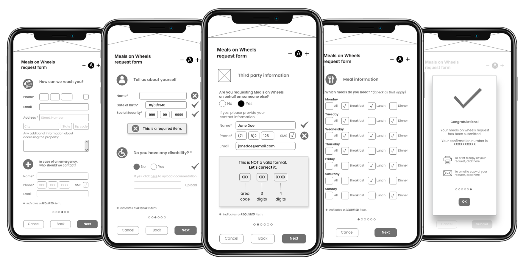
This project truly showed the importance of including high-fidelity interactive prototypes as one of the key deliverables. Being able to interact with a design before the product enters development is esssential for the success of a product.